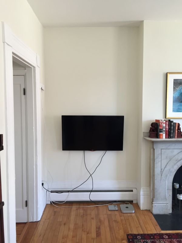
A few months ago, we got a new tv. After years of living in tiny apartments and watching tv primarily on our computers, we were ready to watch tv and movies on the big screen – well, a bigger screen anyway. And since we now had plenty of space in the living room, we chose a big, 40-inch LG tv. But we were still figuring out how best to lay out the room at the time, and we weren’t exactly sure where to put the tv. We wanted to be able to watch tv comfortably, but we also didn’t want the tv to be the room’s focal point.
The most obvious option was to hang the tv above the fireplace mantel. But in order to clear the mantel, the center of the tv would have to be at least five and half feet above the floor, which, given the size of the room and the height of the couch, would make for some serious neck strain after watching a two hour movie. Besides, the original, marble fireplace is the focal point of the room, and one of the most impressive features in the entire condo, so it didn’t seem right to distract from it with a tv.
This left the wall in the corner of the room between the entrance and the fireplace as the only viable spot. At first, I thought putting the tv in the corner was a poor choice from a viewing angle perspective, but then I realized I could use an articulated wall mount that would allow us to pull the tv away from the wall and angle it into the room when we’re using it. And when we’re not using it, the tv would recede into the corner.
So we hung the tv in the corner, which, as you can see, left us with a mess of cables running down the wall. There are various cord managers that can be used to conceal cables against a wall or even inside a wall, but this corner of the living room was looking pretty barren. What we really needed was some kind of cabinet below the tv that would hide the cables. But the baseboard radiator would prevent a cabinet from sitting against the wall, and unless the cabinet was really shallow, it would protrude into the room past the mantel, which wouldn’t really look right.
I looked for some sort of wall-mounted cabinet/shelving/drawers that would fit under the tv and above the radiator, but I came up empty handed. Eventually, I realized that the ideal solution would be custom, built-in cabinetry. The shallow alcove formed by the chimney and the corner seems to be asking to be filled with cabinetry and shelving.
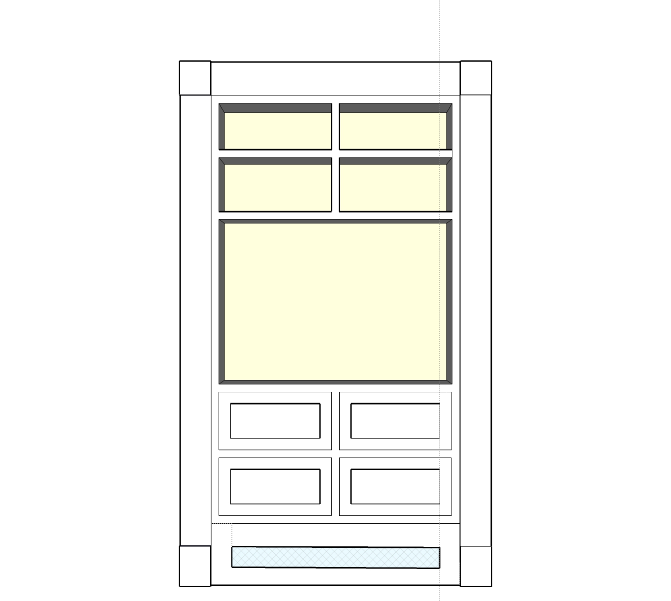
I got in touch with Brandon, the owner of Grain Wood Shop – a custom wood working and furniture shop located in one of the old warehouses in the Boston Harbor Shipyard right here in East Boston – about building a custom built-in. He came over and took a look at the space, and after some back and forth, here’s the design we came up with:
Since this built-in will be a more or less permanent addition to the condo, I wanted to make sure it matched the room’s original architectural elements. After looking through a bunch of pictures of 19th century built-in cabinetry, I decided that this unit should look like a true built-in. In other words, it should be flush with the wall and extend from the floor to the ceiling. Initially, I was picturing cabinets below the tv and shelving above. But after talking to Brandon, I decided to go with four drawers under the tv. The drawers will be more functional and look more interesting than a pair of cabinets. In order to accommodate the radiator, which will be buried under the drawers, the baseboard along the bottom of the built-in will be fitted with a metal grate, allowing heat to escape. The whole thing will be painted white to match the trim.
Here’s a shot of the living room’s side wall. The built-in will go in the alcove to the left of the fireplace, and in an effort to maintain the room’s symmetry, I’d like it to mimic some of the design details of the window on the right. Specifically, I asked Brandon to surround the built-in with casing that replicates the chunky, column-like casing found in the rest of the condo. And again, for the sake of symmetry, I decided to run the built-in shelving only as high as the window, stopping short of the ceiling. I’ll use a piece of sheetrock to close the gap between the ceiling and the top of the shelving, effectively creating a soffit, as a way to preserve the built-in look of the shelving. We’ll lose some shelf space by not taking the shelves to the ceiling, but I think it will look more balanced to maintain a consistent height between the shelving and the room’s four windows. And if we took the shelves to the ceiling, we wouldn’t be able to reach the top shelf anyway.
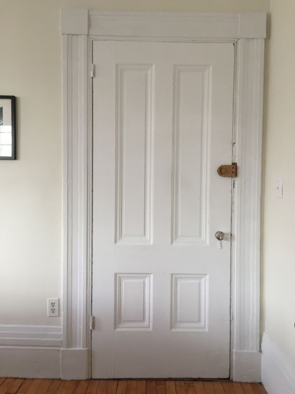
The four drawers under the tv will have raised panel fronts inspired by the paneling of the original door located directly across the room from the new built-in.
Technology changes quickly, and designing permanent features of a house – like built-in cabinetry – around a single piece of technology – like a tv – generally seems like a bad idea. Just ask all those people with late-90s tube tv niches over their fireplaces. But the design of this built-in is somewhat flexible, in that extra shelving can be added later on to fill the area that will house the tv. So years from now when tvs are obsolete and we’re all watching holograms, whoever lives in this condo can convert this built-in to a full bookcase – assuming that books and shelves haven’t become totally obsolete as well.
Brandon is currently in the process of building the cabinetry, but before he can install it, I need to get my electrician to move an outlet for the tv. If all goes according to plan, everything should be done within the next few weeks.


I like the idea of the height of the new built-in being the same height as the window on the opposite side. I would, however, leave the planned soffit off. I think it will be overwhelming to cover that nook completely. Great place for a wireless router (high and out of view) or “up” lights on top to add a little interest to that upper space.
Your newly re-created light fixture looks great, btw!
Thanks Pat, that chandelier was an ordeal, I’m glad it’s finally finished!
From what I can tell from all the Google image searching I did, built-in shelving that has the appearance of a large piece of furniture (has feet or legs at the bottom and ends before the ceiling) is a popular modern design. 19th- and early 20th-century built-ins on the other hand seemed to be fully surrounded with casing and set into a wall. Since I’m hoping to mimic the look of original, 19th-century built-in cabinetry as much as possible, I decided to fill the 11″ gap above the shelving so that the cabinetry looks like it’s built into the wall. But who knows, I might change my mind once I see everything installed!
So glad you’re not perching the TV above the beautiful fireplace. I love my 40-in. TV, but I don’t want to build a shrine to it! Your built-in will look great, and many people won’t even realize it’s not original, thanks to your thoughtful design.
Haha, well said — with all the marble and Greek-Revival architecture, placing the tv above the fireplace would look very shrine-like!
I’m dying to see the finished result, is it ready yet?
We’re finishing up the installation this week — I can’t wait to see how it turns out either! Look for an update at the end of this week or the beginning of next week.
Yay! Thank you for replying…