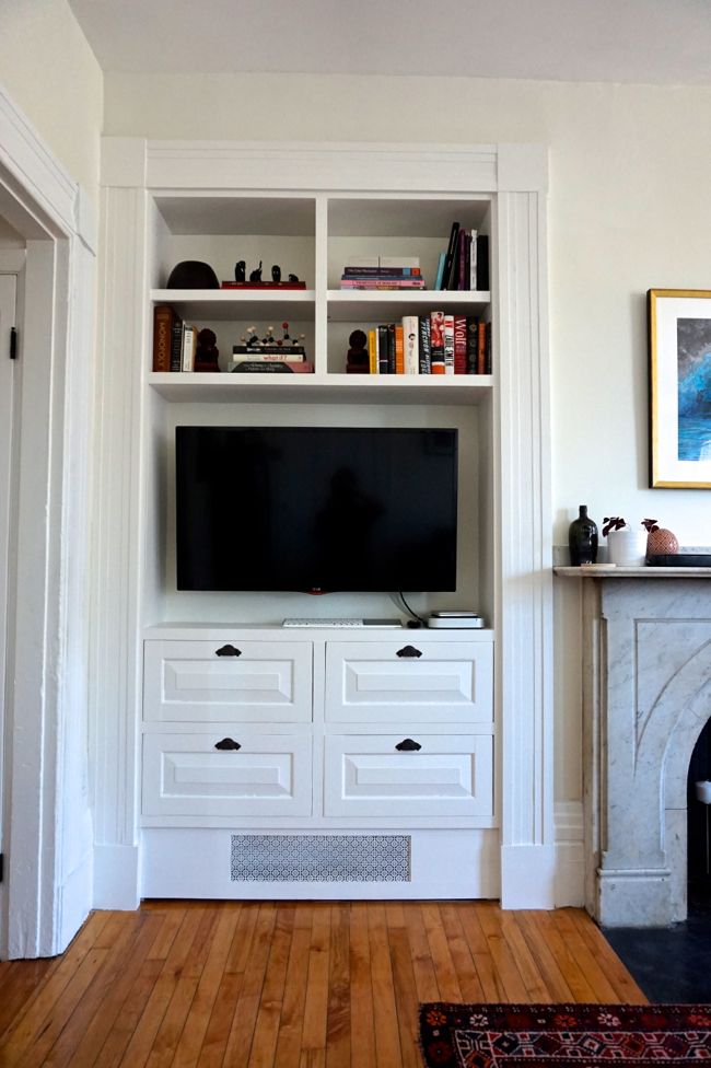
 This past weekend I took a break from working on the stairwell to put the finishing touches on the built-in hutch in the living room. I thought the built-in was finished months ago, but a few weeks after it was installed, resin from the pine casing and drawer fronts began to leach into the white painted finish, discoloring it. It was just a faint yellow streak here and there at first, but after 9 months, the discoloration had spread and darkened. I finally primed the built-in with stain-blocking B-I-N shellac primer and repainted the whole thing last weekend. While I was painting, I realized that the last time I wrote a post about the living room, it was a mostly-empty space filled with left-over materials from the kitchen renovation. A lot has changed since then, and a living room update is long overdue.
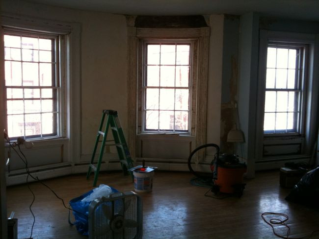
Just a quick reminder before we get started – this room was a complete disaster when I first moved in. Here it is just a few weeks before I bought the place. Chunks of plaster were missing from the wall, some of the walls were covered in textured wall paper, and the maple floors were beat up beyond recognition. My contractor, Gregg, patched and skim coated the walls, and cleaned up and painted the molding, and brought this room back from the dead.
Three years later, the living room has turned out to be my favorite room in the condo. It’s a huge space (by Boston apartment standards, anyway) and it’s chock full of stately Greek Revival architectural details – chunky, column-like casing around the windows and doors, 10-foot ceilings, a monumental marble mantel with a cast iron fireback depicting pastoral scenes, and original, sweeping bow-front windows. Back in the 1840s when the building was completed as a single family townhouse, this would have been one of the most formal rooms in the house. And lucky for me, a lot of this formal architecture was preserved. Furnishing and decorating this room was pretty easy – the room’s architecture does most of the heavy lifting here. Even so, it’s come a long way over the past three years.
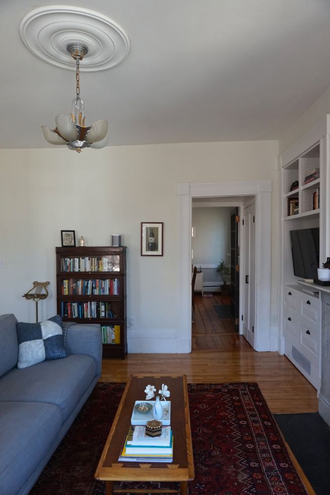
This is the view of the living room as you enter from the dining room. When I first moved in, the pair of closets flanking the mini hallway that connects these two rooms had unfinished louvered doors, which looked completely out of place (and collected a shocking amount of dust). I replaced the louvered doors with two pairs of solid, single panel doors. Now this little hallway fits right in with the living room’s elegant casing and trim.
The new built-in is immediately to the left when you walk into the room. The built-in brought some balance to what was an awkward, empty corner of the room, and at the same time added some much-needed storage and functionality to the space. We hung the tv on an articulated wall mount, which allows us to angle it into the room when we’re using it, and to leave it hidden away in the corner when it’s not in use. I found a set of antique drawer pulls from the 1870s on eBay for the unit’s four lower drawers. The style of the pulls is a little more extravagant than the rest of the room’s austere architecture, but they add some interest to the otherwise boxy built-in.
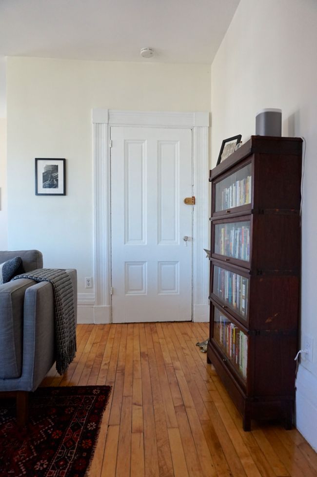
There’s a door to the common stairwell directly opposite the built-in. The size, shape, and style of the built-in reflect this doorway, bringing another line of symmetry to the space. We bought the barrister bookcase on the last day of the Brimfield Antique Show last fall.
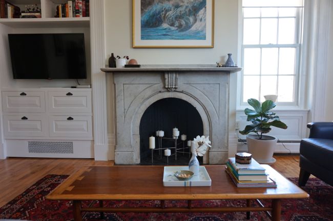
Working our way around the room, we come to the marble fireplace. This is the focal point of the entire room — even though the fireplace is non-functional (the chimney masonry is degraded), it’s hard to miss this giant chunk of carved marble in the center of the room.
We arranged the seating area around the fireplace, with the sofa facing the mantel. We didn’t want to hang the tv over the fireplace, but clearly something needed to go there. We eventually settled on this print of a seascape collage by Matthew Cussick. The entire image is made of cut-out pieces of old maps and charts. It seemed appropriate since we live right next to the harbor.
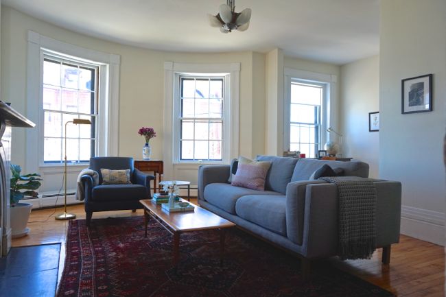
For a while we thought about creating an L-shaped seating area with the sofa and a love seat. This is a big room – the carpet in the center is 9×7 feet to give you a sense of scale – and it could easily accommodate a love seat/sofa set up. But after years of living in cramped apartments, we really enjoyed all of the open space. So instead, we decided to get a small armchair and an end table to fill in the short side of the L-shaped seating area, leaving plenty of empty space around the furniture. We also chose an arm chair and sofa with low backs that wouldn’t block the bow-front windows at the back of the room.
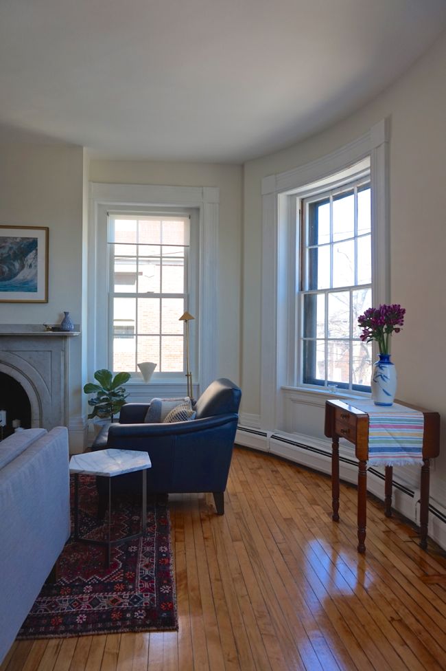 And speaking of the bow-front, we also decided to leave it mostly open. The small drop-leaf table is from an antique mall in Worcester. It looks like it was hand-made and probably dates from the mid-19th century. It’s the only piece of furniture in the room that’s close to the same age as the building, and it looks right at home between the two bow-front windows.
So that’s it, the current state of the living room. It feels like the most put-together room in the condo, and it’s become one of our favorite places to spend time at home. I’ll be back next time with an update on progress in the stairwell, where things are finally starting to come together.





Your living room is absolutely lovely! The windows, the fireplace, the moldings…well, just everything. It looks like such a comfortable and cozy room.
Thanks! We really lucked out with this space, especially considering how dire it was when we moved in.
It’s beautiful! And I’m so glad to see you ended up finding all of the glass for your chandelier. If I remember correctly you searched the internet’s entirety for all of the components. All of your (and your contractor’s) hard work has put the shine back into the space. Nicely done.
Yes, finding all of the shades for the chandelier was an ordeal! I think it took about six months for me to find all five of them, one or two at a time, on eBay.
Dan, your living room is beautiful. I’m sure the architecture does the heavy lifting, as you say, but I think that you two really left a lot of breathing room for it to do the lifting! 🙂
I especially enjoy hearing about your reasoning for your decisions (not only in this post).
There was no “lucking out,” just hard work and follow-through. Well done everyone!
This room is so beautiful. Just looking at it makes me feel calm and cozy. Your entire place is lovely, nice work on creating a home.
I love how open and airy this room looks. You’ve done an excellent job of not overstuffing it. It’s not always easy to practice such restraint! The light flooding in and bouncing off the restored maple floor is beautiful.