Sep 052014
 
 September 5, 2014  Living Room 6 Responses »

office

A few years ago, in her final semester of college, Mara took an intro studio art course. As part of the course she visited the Nature Lab at the nearby Rhode Island School of Design. The RISD Nature Lab is chock full of the kind of stuff you’d expect to find in a natural history museum. The walls are lined with glass cases and cabinets filled with collections of mounted butterflies, animal skulls, seashells, mineral specimens, and pressed plants. Taxidermied birds perch atop the cabinets and fully articulated human skeletons hang from the ceiling. But unlike a natural history museum, the Nature Lab is set up as a studio art space where visitors are encouraged to take specimens out of their cases to examine them, sketch them, and interact with them. While she was there, Mara sketched a rodent skeleton and a series of skeletal forearms from various animals.

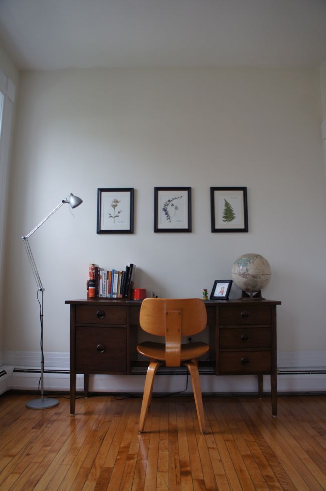
Inspired by her time at the RISD Nature Lab and the emerging turn-of-the-century-reading-room vibe in our living room,  Mara decided we should hang some framed, pressed flowers on the walls. There are a lot of blank walls in the condo, which leave the place looking unfinished. Artwork can be expensive and it’s difficult to find just the right piece of art. So when Mara suggested hanging some pressed flowers in the office alcove off the living room, it sounded like a great, inexpensive way to add some interest to the space.

Collecting botanical pressings and other natural ‘specimens’ and displaying them in the home was a popular pastime in the late 1800s. But in the past few years, sciencey decor (and I think botanical pressings fall under this category) seems to have become pretty trendy once again. I’m not sure why collecting and displaying terrariums full of succulents, lab glassware, and other home decor that evokes nature and science has become so popular. Maybe it’s nostalgia for a bygone time when gentlemen scientists sought to understand the mysteries of the natural world simply by collecting, categorizing, and preserving bits and pieces of it. Or maybe it’s related to the revival  of other late-19th century pursuits, like brewing your own beer, keeping your own chickens, or growing your own mustache. In any case, we thought a few framed pressed plants might look nice hanging over the desk in the office alcove. And although we aren’t trying to recreate the room as it existed at some point in the past, there’s something appealing about the fact that framed botanical pressings wouldn’t have looked out of place hanging in the same room a century ago.

We collected flowers for pressing around my childhood home in Connecticut while visiting my family a few weeks ago. Most of the flowers available to us were wildflowers – some might call them weeds – and we looked for plants and flowers that weren’t too thick or fleshy. It turns out that plants that are too thick don’t press well and a lot of detail can be lost if the plant is mashed to a pulp as it’s pressed. Once we got the flowers (and one fern) home we placed them between sheets of parchment paper and slipped them between the pages of a few large books. We piled a bunch of other books on top of these books to make sure that the flowers were thoroughly flattened, and then we left them alone for two weeks.

I work as a chemist and also write a science blog, so it should come as no surprise that pressed plants aren’t my first experience with science decor. For the past few years I’ve kept a molecular model – currently isoamyl acetate, the primary flavor component in Juicy Fruit Gum – on the living room mantel. I spend a lot of time thinking about molecules at work, and I think the 3-dimensional geometry of many molecules is beautiful in its own right. But I also think molecular models are just plain cool. They’re simple representations of our achievements in understanding how the world works on an atomic and molecular level. The appeal of pressed plants, on the other hand, is mostly aesthetic. But at the same time, they also recall the early days of biological sciences when observing and documenting differences among living things gave way to questions about why those differences exist and how they arose.

Isoamyl Acetate

After two weeks, we took the flowers, which were now flat and dry, out of the books. We picked up some inexpensive frames and some watercolor paper to use as a backing at a craft store. Mara cut the backing paper to size and carefully attached the pressed flowers to the paper with Elmer’s Wood Glue applied with a toothpick. She then added a few thin strips of florists’ tape across the stems and secured the tape with a few dabs of wood glue. Apparently plant pressings are traditionally mounted using thin strips of tape, but in our case the tape was more decorative than functional.

We used this website to help identify our flowers and fern, and we were disappointed to learn that the names of some of our flowers – common soapwort, fleabane – weren’t all that elegant or exciting. Nevertheless, Mara wrote the common and latin names of the plants on small rectangles of watercolor paper, which she then glued to the paper backing. (She was worried about messing up while writing directly on the paper backing, which at this point would have been a tragic turn of events since the pressed plants were already glued down). Labeling the plants in this way, we felt, gave the pressings some botanical legitimacy.

Finally, before framing the mounted pressings, Mara sealed each pressed plant with three coats of clear, matte spray fixitive – the same stuff used to prevent finished charcoal drawings from smudging. We weren’t sure if sealing the pressings was necessary, but figured it couldn’t hurt and might help prevent the colors of the stems and flowers from fading.

Pressed Flowers

In the end, the framed pressings look great hanging over the desk. Up to this point we only had prints and photographs on the walls, so it’s nice to bring something natural inside to keep things from feeling too sterile. But the best thing about this project might be the price – we spent a total of about $30 on the three pressings, most of which went toward the frames. A few months ago while looking at kitchen cabinet hardware, I noticed that Restoration Hardware was selling some similar framed botanical pressings starting at $199. Granted, the Restoration Hardware pressings were collected 100 years ago in Sweden, but it was much cheaper and a lot more fun to make our own.
Pressed Fern

Pressed Bellflower

Pressed Soapwort


Aug 012014
 
 August 1, 2014  Living Room 7 Responses »

I started working on my building’s front door fully intending to finish painting the door and the surrounding trim over the course of a few weekends. But now, a month later, the door remains completely unpainted. There are a number of good and not-so-good reasons for the snail-like pace of this project. Earlier this month, some hot, swampy weather settled in over Boston, leaving me unmotivated to work outside, or to exert myself in any way, really. And then, I spent the last week and a half on a combined vacation/business trip in Italy and Slovenia. So while I continue to make slow progress on the front door, I thought I’d update you on some recent changes in the living room.

Over the past few weeks and months, I’ve begun to formulate a plan to convert the condo’s front room from a staging area for the kitchen renovation into an actual living room filled with the kind of stuff you’d expect to find in a living room – seating, lighting, artwork on the walls, maybe a bookcase. A key part of this plan involved finding a rug for the room. I imagined that the rug would define a seating area and help separate the living room from the office, which is just an alcove on one side of the room. The architecture of the room is very formal, so I wanted a classic rug that would fit in with some of the room’s fancier elements. But I also wanted a rug that would offer some color and interest. An antique Persian or Caucasian rug seemed like it would fit the bill.

So I began scouring eBay for a large, affordable, antique rug, which, I quickly realized, was like searching for Bigfoot. Antique Persian rugs, it turns out, can be very expensive. As you might expect, rugs in pristine condition command top dollar, while slightly worn rugs are a little more affordable. Antique, hand-knotted rugs are hard-wearing and can last for generations, so even worn rugs have many years of use ahead of them with proper care. And I actually like the look of old, worn rugs. So I narrowed my search to rugs with areas of low or missing pile, but I drew the line at rugs with large holes or serious damage.

After a series of crushing losses in which I was outbid on rugs in the final seconds of auctions, I came across a promising rug with a low starting bid. The seller didn’t seem to know anything about the rug beyond its questionable provenance – the listing stated that it was found “hidden away at an old, Southern estate” (which brought to mind a giant, decaying plantation house shrouded by towering oak trees draped in Spanish moss). The rug was about the right size, and it looked pleasantly worn-in with low pile – it seemed like a perfect fit for the living room. So I stalked the listing for a few days, waited until the final moments of the auction, placed my bid, and won the rug for $88, which seemed like a bargain since I had resigned myself to spending three times as much for a decent rug.

Here’s the rug after it arrived and I unpackaged it and spread it out in the living room:

Living Room Rug

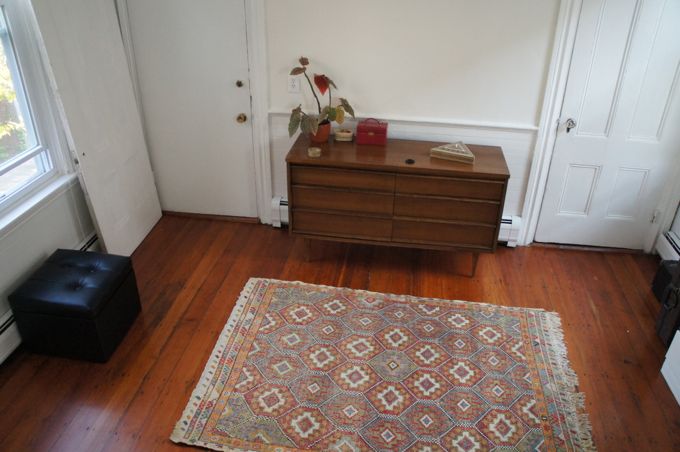
I know very little about Persian rugs, but the rug appears to be pretty old and hand-knotted, possibly in the Herati style. It’s covered in an intricate, dense pattern of geometric lines, angles, and floral shapes with a medallion in the center. The edges are slightly abraded, and the rug could use a cleaning, but otherwise, it’s in pretty good shape. It gives the living room the feeling of an old library reading room, which I like.

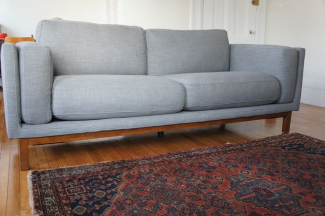
Along with the rug, we also got a new sofa. When I moved into the condo, I brought a love seat sofa with me. This half-size sofa was a perfect fit for my old, 400-square-foot apartment, but in the new, much-larger living room, the proportions were all wrong – it looked like a piece of doll furniture. So after looking at a bunch of different sofas that fell within our price range, we settled on the Dekalb Sofa from West Elm, which at 85 inches long, is big enough to fit the room.

On the other hand, since the condo is located on the second floor at the top of  a narrow, curved staircase, the sofa was also potentially too big to fit up the stairs. So before placing the order, I carefully measured the stairwell. The stairs were wide enough to accommodate the narrowest dimension of the sofa with a few inches to spare, but I wasn’t completely sure that the sofa would fit around the curved corner at the top of the stairs. After some more careful measuring, I was about 95% sure that the sofa would fit, which, since I really liked the sofa, was good enough for me. So we ordered the sofa. West Elm was having a 15% off sofas sale at the time, and when I went to the store to see the sofa in person, they offered to reduce the price by an additional 10% to cover the cost of shipping. So, all in all, the price was pretty reasonable. And when the sofa finally arrived, 10 to 12 weeks later, the delivery guys carried it straight upstairs and around the curved corner without any trouble.

The New Sofa

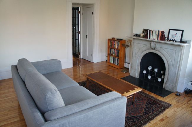
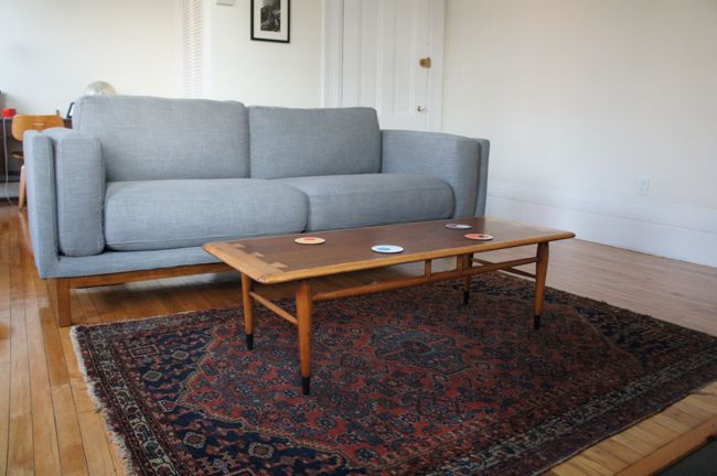
It’s a big, comfortable sofa with plenty of room to spread out, but it doesn’t have the overstuffed, globular appearance of many larger sofas. We chose a medium-gray linen upholstery, and the lighter color keeps the sofa from looking like a giant black hole in the center of the room. Before the sofa arrived, I wasn’t sure how best to position it in the room. There were two obvious options: floating lengthwise in the center or the room, facing the fireplace, or positioned widthwise just in front of the bowfront windows, facing the entrance to the room. But once the sofa arrived, it was clear that floating the sofa in front of the fireplace made the most sense. It fit the proportions of the room, which is longer than it is wide, and helped to divide the office alcove from the living room space.

New Sofa Position

New Sofa

So, the living room is starting to come together. But there are still a few things on my wish list for the room: a pair of club chairs to go in front of the bow front windows, a barrister bookcase, a side table or two, a lamp, a giant piece of art for over the fireplace, and an overhead light fixture – maybe an art deco chandelier if I can find one for a reasonable price.

Jul 032014
 
 July 3, 2014  Exterior 8 Responses »

When we left off last time, I was agonizing over paint colors for my building’s front door, but I hadn’t actually made any progress toward painting the door. (Thanks, by the way, to all of you who offered color suggestions – I still haven’t bought paint, so you’ll have to wait for another post to see what color(s) I end up choosing.) This past week I finally started in on the long list of prep work that needs to be done before I can actually paint the door.

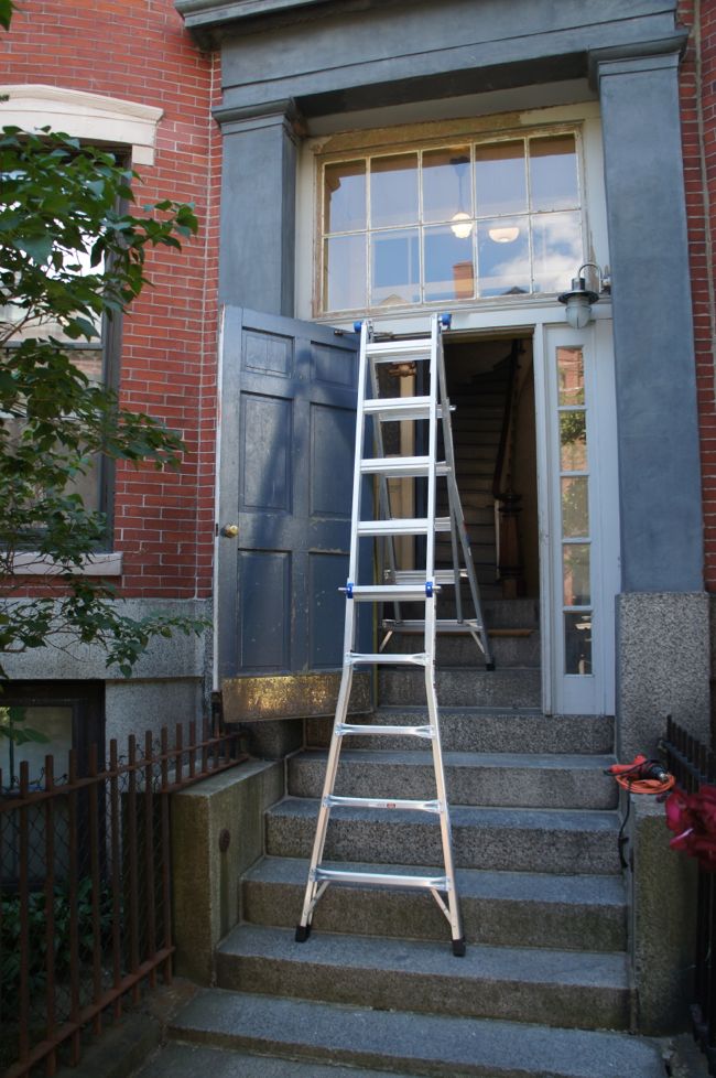
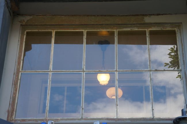
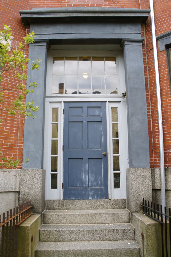
I decided to work from the top of the entryway down, so the first order of business was reglazing the transom window above the door. The window sits about 12 feet above the front steps, making it completely inaccessible with the short step ladder we had on hand. I ended up buying a new, 22-foot multi-position ladder to reach the window. Each side of the ladder can be adjusted independently, allowing it to be safely positioned on the steps. With all of the tall ceilings and narrow staircases in my building, I have a feeling this ladder will be getting some serious use even after this front door project is finished.

Ladder on Steps

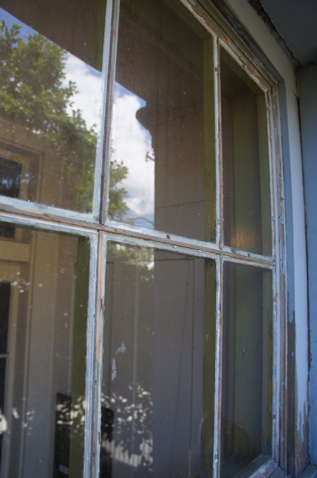
When I finally got an up-close look at the transom window, I found that it was a mess of cracked, crumbling, and missing glazing putty. Up until a few months ago when I reglazed a salvaged french door, I had no idea what glazing putty was. It turns out it’s an oil-based putty with the consistency of bread dough that was used to secure and seal panes of glass to the frames of old divided light windows. It’s no longer used on modern windows, most of which are not true divided light windows with separate glass panes. As glazing putty dries out over time, it can crack and flake away from the window, providing an opportunity for water to seep into the frame and rot the window. So every few years the putty needs to be replaced. And the putty on the transom window over the front door was long overdue for replacement.

The putty was in such bad shape that I was able to remove most of it by gently scraping it away from the window panes with a putty knife. I was worried about cracking the glass, so I was careful not to get too vigorous with my scraping. I removed the last, stubborn bits of old putty with a heat gun – the heat softened the putty to the point where I could easily scrape it off the window. If you ever find yourself reglazing a window, it’s technically possible to leave some of the old putty behind so long as it’s securely attached to the window, but it’s easier to apply the new putty without any of the old putty in the way. As I scraped away the old putty, I uncovered the glazing points – little metal triangles stuck into the wooden dividers around the window panes that act as clips to hold the glass in place. I made sure to keep all of the glazing points in place to prevent the glass from falling out of the window while I worked. Once I’d removed the putty and scraped away some of the surrounding loose paint, I was left with this:

Glazing Putty Removed

Glazing Putty Removed Close Up

There seems to be some disagreement about whether it’s necessary to prime the exposed wood dividers before reglazing the window, but I figured it couldn’t hurt. So I taped off the windows and primed the dividers with an oil-based primer (this is important since the putty is also oil based). Once the primer was dry, I finally got down to the business of actually glazing the window. Most guides to glazing windows suggest removing the window from its frame and glazing it on a horizontal surface. That wasn’t really an option here since the transom window is built-in. So I glazed the window in place, which wasn’t so bad, although standing on a ladder working with my hands over my head for a few hours turned out to be exhausting.
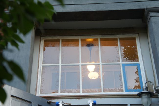
Glazing technique is pretty straightforward, but it takes some practice to get the hang of it. I worked on one side of a pane at a time, packing the glazing putty into the corners between the glass and the wood divider with a putty knife. Then I ran the putty knife along the edge of the divider, removing excess putty and creating a sloped edge. The putty is forgiving – it can be smoothed out with a finger, or scraped out and reapplied if it becomes mangled beyond repair. Here’s the window after I finished glazing around all 10 of the panes:

Reglazed Transom Window

Glazing Close-up

Once the putty has dried, I’ll clean off the oily residue on the windows left behind by the putty (the smudges in the pictures above). The instructions on the glazing putty suggest waiting 7 to 14 days for the putty to dry before priming and painting, but if the hot, swampy weather we’ve had in Boston for the past few days keeps up, it’ll probably be at least two weeks before the putty has dried enough to be painted. In the meantime, I’ll continue scraping the loose paint off of the door and surrounding trim.

Jun 162014
 
 June 16, 2014  Exterior 21 Responses »

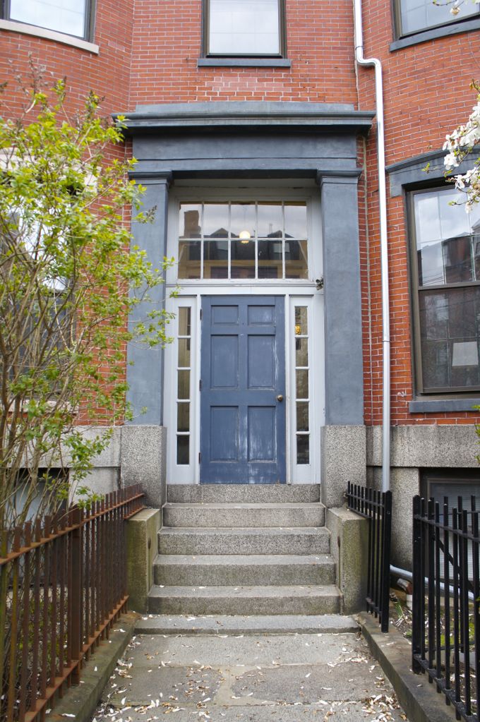
Front Door

I’m not sure when it happened, but at some point over the course of this past winter the front door to my building went from looking acceptable to looking downright shabby. The building is perched on a hill next to Boston Harbor, and it gets pretty windy in these parts – every winter the front door is battered with snow and ice, and years of this wintry abuse has taken its toll on the door’s paint job. It’s worn down to the primer coat in places, and the paint around the inset panels is chipped and peeling. The surrounding side lights and transom window aren’t in much better shape.

The front door provides visitors and passersby with their first impression of the building, so I think it’s important to keep it looking decent. And of course some regular maintenance will go a long way toward preventing costly repairs down the road. With this in mind, I volunteered to repair, repaint, and generally spruce up the front door and surrounding trim. Here’s what needs to be done:

  1. The transom window needs to be reglazed. I’ll remove all of the old, cracked and failing glazing putty from around each glass pane, prime the wood dividers, and apply new glazing putty. I have some glazing experience – I spot reglazed the salvaged french door I used between the dining room and living room last year – so hopefully this part goes smoothly.
  2. Scrape/strip all of the peeling paint from the door and trim. I did a quick lead paint test on the door and trim, and, interestingly, the test was negative. There’s only one or two coats of paint on the door and trim, which suggests that it was completely replaced within the past 20 or 30 years. But the fact that there’s no lead paint here means that I’m free to scrape off the peeling paint rather than use a wet stripping method, which will make my job much easier.
  3. Prime everything. I’ll use a shellac-based primer to spot prime any knots or stains. The new glazing putty will need to be primed with an oil-based primer, and I’ll use an all-purpose exterior primer for everything else.
  4. Caulk all of the joints and seams in the trim.
  5. The hinges on the door are really rusty, so I’ll remove them, prime them with Rustoleum rusty metal primer, and spray paint them black.
  6. Paint everything

The only thing left to decide is paint color. As long as I don’t choose anything too weird, my neighbors don’t have strong feelings about the front door color. The giant, sandstone portico surrounding the front door is painted a medium blue-gray. It matches the sills and lintels around the building’s windows, and I have no plans to repaint it. So I’d like to find a color that complements the portico. My first thought was to paint the door and trim a glossy, formal black, or a dark navy, but I couldn’t quite picture how it would look. So this past weekend Mara and I headed across the harbor to Boston’s South End for some inspiration.

Boston South End Row Houses

South End Union Park

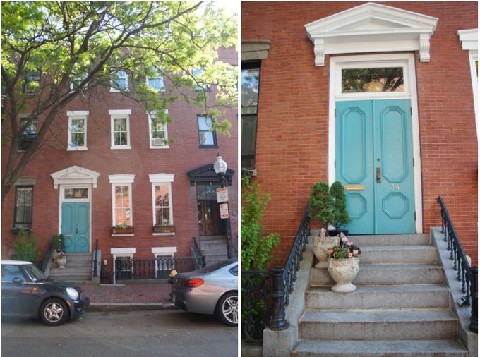
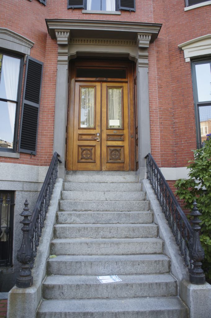
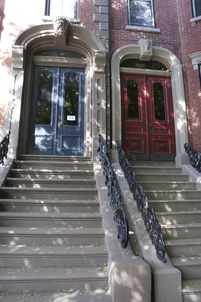
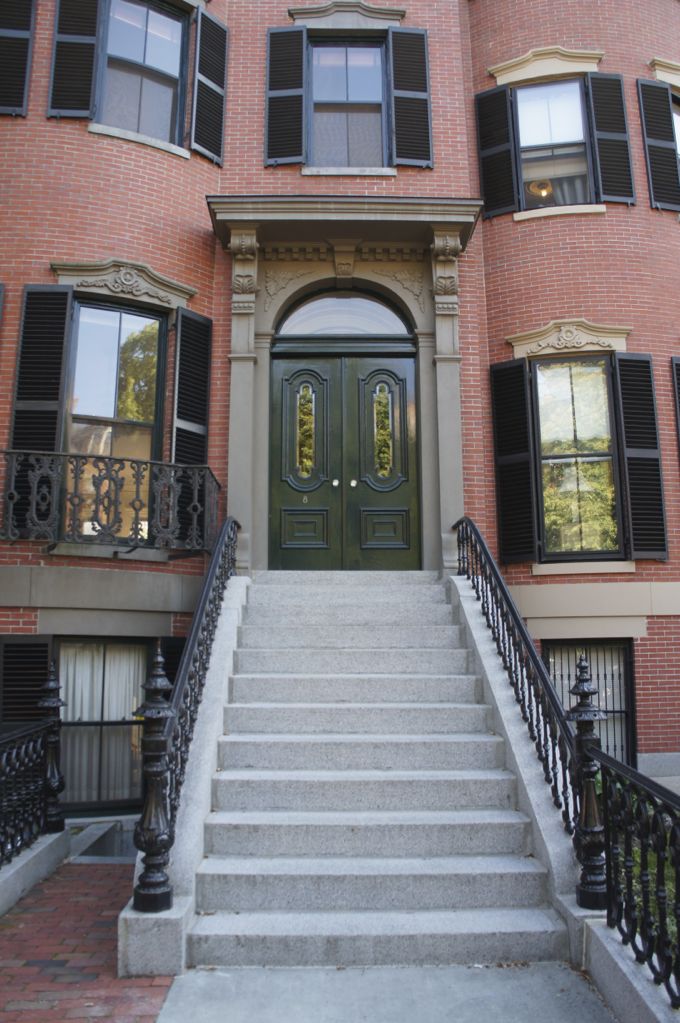
The South End is the largest Victorian brick row house district in the country. It’s made up of block upon block of impeccably restored row houses that were built at around the same time as my building in the mid to late 19th century. And many of the row houses in the South End are built in a very similar style to my building, with bow fronts and some Greek Revival architectural elements. It seemed like a good place to check out a variety of different front door colors that might suit my building. So let’s check out some doors, shall we?
Turquoise DoorA brightly colored door like this turquoise door looks great with white trim, but I don’t think it would be right for my building.

ShuttersA lot of buildings in the South End have historical or replica shutters, which made me wish my building still had shutters. But that’s another (much more expensive) project for another time.

Wood Door

Blue and Red Doors

Green Door

Red Door

Unlike my building’s front door, most of the doors we saw were double doors without a lot of surrounding trim. This single red door with side lights and a transom was the most similar door we saw. The door and trim are painted different colors, which made me wonder if I should keep the door and trim different colors on my building as well. Also, I think we may need a planter of some sort by the front door for flowers and/or a little topiary thing.

Front Door 2

Seeing all of these nicely restored entranceways reinforced the fact that my front door is looking pretty crappy. But it also made me even more unsure of what color to paint the door.

East Boston Row House

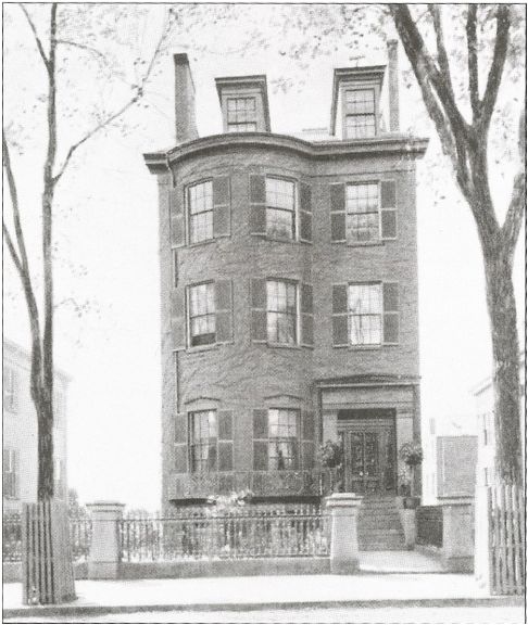
Finally, here’s a photo of a row house just down the street from my building in East Boston, taken soon after it was built. This building is very similar to mine and was probably built at around the same time. Obviously, the photo is black and white, so it’s impossible to tell what colors were used, but it looks like the front door was painted a dark color, possibly black, which makes me think I should stick with a dark color for my front door. I’m currently leaning toward a dark navy door but I’m still not sure whether I should paint the surrounding trim a different color. So I’m officially soliciting opinions – what color should I paint my front door?

Jun 052014
 
 June 5, 2014  Bedroom 20 Responses »

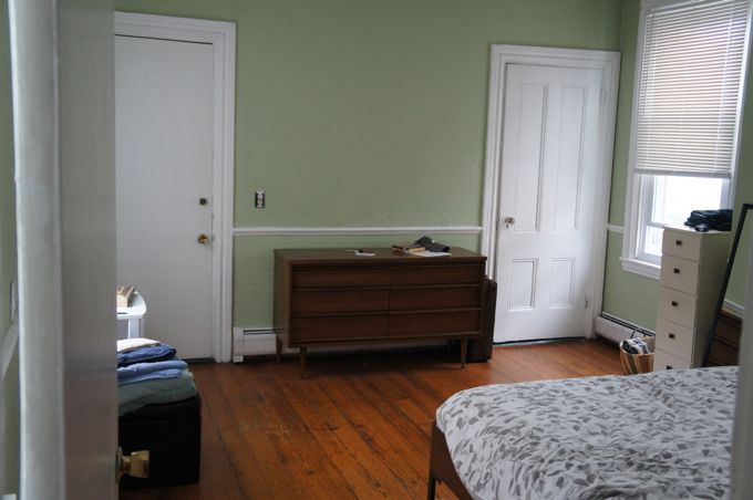
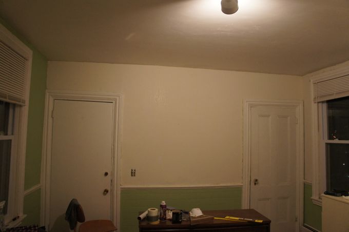
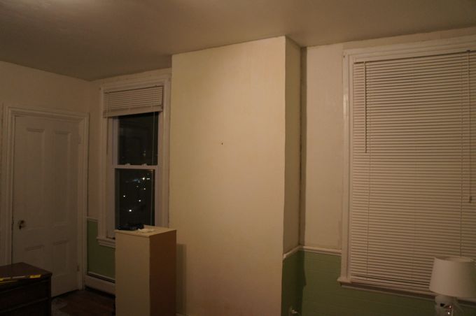
The very first project I undertook in the condo was repairing and painting the bedroom walls. When I first moved in, the entire bedroom was painted a nauseating, algae green color. Even the room’s shiplap wainscoting was inexplicably painted the same eggshell green as the walls. Waking up surrounded by this color made me feel like I was drowning in a bowl of split pea soup.

Bedroom Before Clearly, the bedroom needed some fresh paint. But it turned out that this terrible color was just the start of the problems with the bedroom walls. Under the green paint there was a layer of textured wallpaper, and under the wallpaper was the original plaster. In many places, the walls felt soft and squishy. I didn’t know much about plaster walls at the time, but I was pretty sure they weren’t supposed to be squishy. After a little research, I discovered that the squishiness was a sign that the plaster was detached from the underlying structure of the wall.

When the wall was originally constructed, wet plaster was pressed into the lath – a series of horizontal wood slats running across the studs and spaced about 1/4 inch apart. The wet plaster was smooshed into the gaps between the lath, and when it hardened, it was held against the lath by the ridges of plaster, or ‘plaster keys’, that filled these gaps. But as the building shifted and settled over time, some of the plaster keys broke, leaving large sections of the plaster wall floating unsecured. So before I could paint the room, I needed to strip the wallpaper and stabilize these loose sections of plaster.

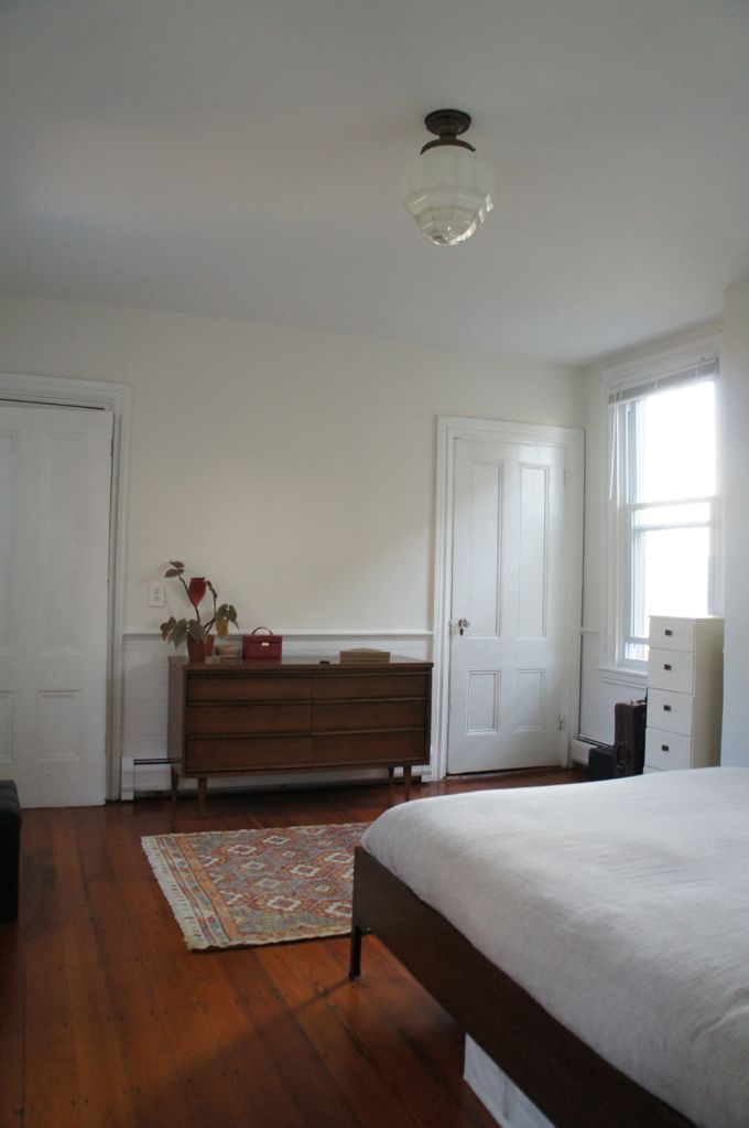
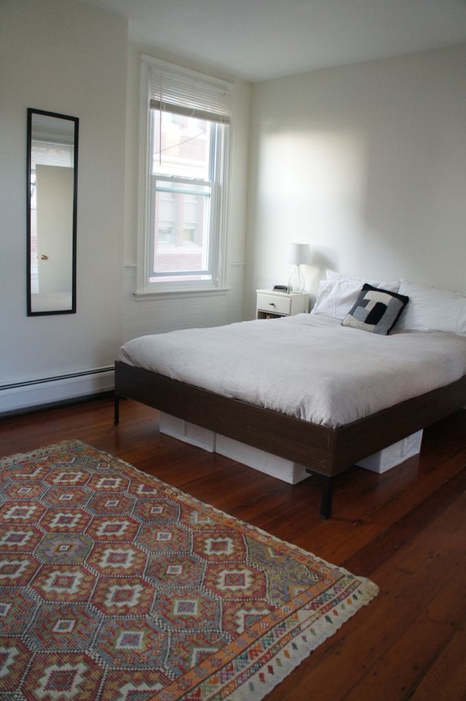
Now, before I show you a bunch of frankly horrifying pictures detailing the process of repairing and painting the walls, here’s a picture of the room today.

Bedroom After

Everything turned out ok. I opted for white paint – Benjamin Moore White Dove – for the walls. And I painted the wainscoting the same semigloss white as the trim. Everything is nice and clean and bright.

Anyway, back to the topic at hand. The first order of business was to strip the old wallpaper. There are a number of ways to strip wallpaper – steaming and scraping, or perforating and coating with stripping solution are two of the most common methods – and you can find plenty of youtube videos of people employing various wallpaper stripping methods and making it look easy. But I soon found that my wallpaper was particularly uncooperative. It was a thick, textured paper that had been covered in several layers of paint, and it wasn’t prepared to release its decades-old grip on the walls without a fight. Although it was loose and bubbling in places, it clung to the wall with unrelenting tenacity in others. In the end, I used a 5-in-1 painter’s tool and brute force to scrape the paper off of the wall. For the most part, the wallpaper came down in frustratingly tiny bits and pieces, but every once in a while a big, immensely satisfying sheet of paper would peel away from the wall all at once. As the wallpaper came down it left behind a film of ancient paper and adhesive residue that looked something like this.

Wallpaper Residue

I soaked the walls with DIF wallpaper stripper before scraping off these final, stubborn bits of paper and adhesive. As a side note, windshield washing fluid or soapy water is cheaper than the DIF stripper, and I’ve heard it works just as well.

Once all of the wallpaper was down, I could finally see the underlying plaster, and it didn’t look good. In fact, the whole room looked much worse than when I’d started. The plaster was cracked and crumbling in places. A few areas had been patched with plaster of paris that appeared to have been applied with a butter knife. There were even a few small holes where chunks of plaster had fallen out of the wall. I began to wonder if stripping the wallpaper and uncovering this mess had been a mistake, but there was no turning back now.

Repairing damaged plaster is slow, agonizing work. In many cases it’s more time consuming than tearing out a plaster wall and replacing it with new sheetrock. I never really considered this option because I really like old plaster walls – their trowel marks and other irregularities are part of the charm of an older house. Plaster also offers some practical advantages over sheetrock: it’s inhospitable to mold, provides superior sound insulation, and is more durable than sheetrock. And on top of everything, I wasn’t really in the mood to gut my bedroom since I was actually living in it at the time.

So I was stuck figuring out how to repair my crumbling plaster walls. As far as I know, there are two methods for repairing damaged plaster, both of which accomplish the same result of reattaching the plaster to the underlying lath. The first and most common method involves attaching the plaster to the lath using screws and special washers called plaster buttons, which distribute the pressure of the screw and prevent the surrounding plaster from cracking. The second method involves using construction adhesive to glue the plaster to the lath. In both cases, the wall needs to be patched and skim coated to a smooth finish after the plaster has been stabilized.

I came across this incredibly detailed and very helpful article on the adhesive method of plaster repair, and decided to give it a try. If you’re looking for a full break down of what was involved here, I’d recommend reading the article. But essentially, I drilled a bunch of little holes in the wall, injected construction adhesive into the holes with a caulk gun, and temporarily clamped the plaster to the lath with screws and washers while the adhesive dried.

Reattaching Plaster

24 hours later, once the adhesive had dried, I removed the screws and washers and patched the holes with plaster of paris. I also took this opportunity to patch some of the areas of missing plaster with more plaster of paris. With the plaster firmly glued to the lath, the walls no longer felt squishy, but they were still uneven and a little lumpy. To achieve a smooth, flat surface, I needed to apply a skim coat, or a thin finish coat, of joint compound to the entire wall.

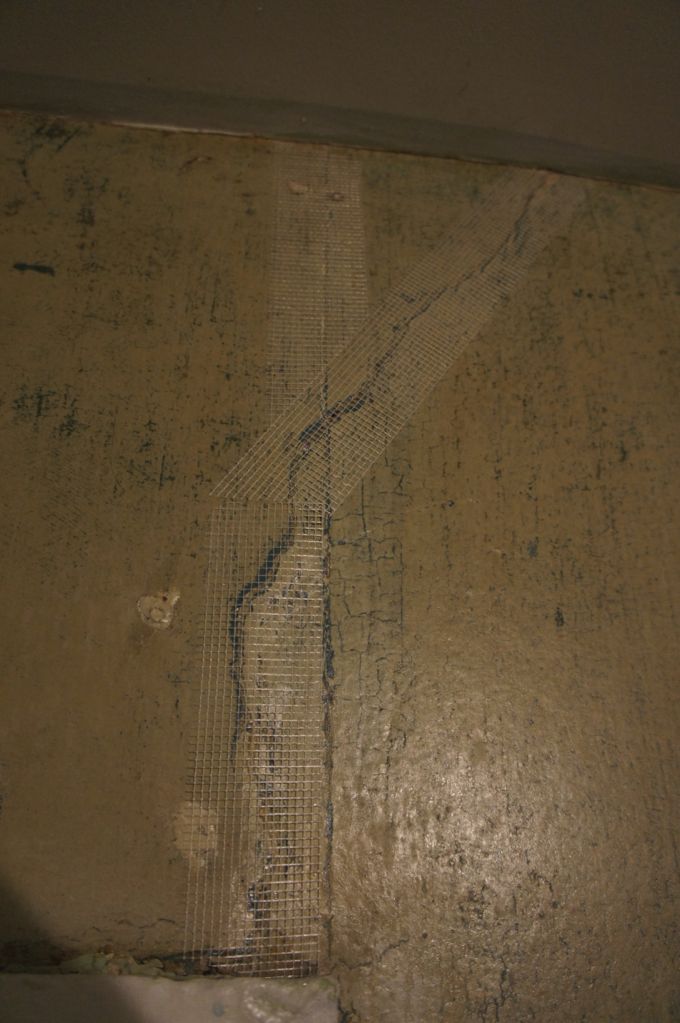
But before I moved on to skim coating, I primed the walls with Gardz Sealer. Gardz has the consistency of watered-down Elmers Glue and dries to a hard, shiny surface. It seals in any leftover wallpaper residue and provides a stable surface for skim coating. It probably wasn’t necessary here, since I cleaned off the walls pretty well, but I wasn’t taking any chances. Next, I covered all of the cracks in the walls with fiberglass mesh tape. The idea here is that the fiberglass mesh isolates the finish skim coat from the underlying damaged plaster and prevents the crack from reappearing.

Fiberglass Mesh Tape

I used premixed, lightweight joint compound – the kind that comes in a bucket – to skim coat the walls. This was my first skim coating experience, and it took me a while to get the hang of it. The real breakthrough came when I started using the Magic Trowel, which, despite its name, cannot be used to build enchanted walls. In reality it’s nothing more and nothing less than a big, heavy-duty squeegee. I don’t possess the skill to manipulate plaster with an actual hawk and trowel. So instead, I applied a rough coat of watered-down joint compound to the walls using a drywall knife and a paint roller. And then, while the joint compound was still wet, I ran the Magic Trowel over the wall to smooth everything out and remove any excess joint compound. Here’s what the back wall of the bedroom looked like partway through this process.

Halfway Through Skim Coating

I had to apply two coats of joint compound to get a smooth, flat surface. Once the final coat of joint compound was dry, I used a drywall knife to scrape off all of the little ridges and high points left behind by the Magic Trowel. Very little additional sanding was needed. I finished the skim coat by burnishing the raw joint compound. The process of burnishing the walls involved lightly dampening the dried joint compound with water from a spray bottle and running a drywall knife over the surface of the wall with firm pressure at a steep angle in an asterisk pattern – up, down, side to side, and diagonally. This process compressed the joint compound, and the result was a hard, smooth, slightly shiny surface that looks and feels a lot like the original plaster.

after skim coating 1

after skim coating 2

The whole process of repairing, patching, and skim coating the bedroom walls took me several months of working evenings and weekends. So by the time I was finally ready to paint the room, it felt like I’d reached the home stretch. I primed the walls with all-purpose water-based primer before applying two coats of paint. I’ve always thought that painting was tedious and boring, but at this point it was actually fun and satisfying, if only because it went so much faster than skim coating. After the walls and trim were painted, I disassembled all of the rusty, beat-up baseboard radiator covers, primed them with metal primer, and painted them to match the trim.

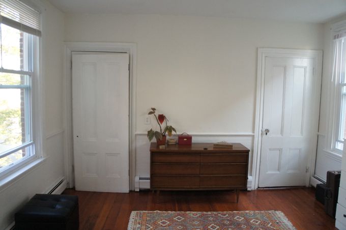
Bedroom After 2

Bedroom After 3

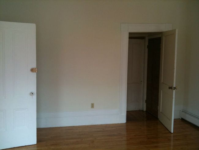
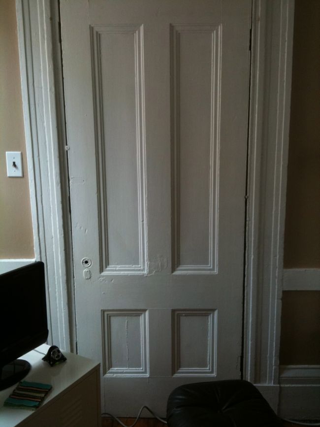
So here it is, the fully repaired and painted bedroom. The room still feels unfinished. The door on the left in the picture above leads to the building’s rear stairwell. It’s currently a cheap, hollow-core door, but I’m planning to replace it with the solid, four panel door that’s leaning against it in the picture. It’s the same panel door that was used to seal off the condo’s front room. I’d also like to reconsider the room’s layout and find some new nightstands. And maybe the bed needs a headboard? And of course we now have a lot of big, empty, immaculately smooth walls in this room that could use some artwork.

Bedroom Light Fixture I also replaced the overhead light fixture with this classy Art Deco shade I found on ebay. The fixture itself is from Schoolhouse Electric. Strangely enough, I’ve found that Art Deco stuff nicely complements my building’s Greek Revival architecture. Although the two styles were popular at very different times, they both emphasize bold linear designs.

Bedroom Floors

One of my favorite aspects of the room is the floor. I had it refinished this past year and it turned out beautifully. It’s heart pine and each floor board runs the full length of the room. It reminds me of a ship’s deck. But the floor isn’t the only thing about the room that reminds me of a ship.

Bedroom View Day

The bedroom is located in the back of the building, which juts out toward Boston harbor like the bow of a ship. Here’s the view out one of the bedroom windows. It’s a pretty impressive view, even though there’s a telephone pole in the middle of it. There are actually water views out the windows on either side of the bedroom, and these views of the harbor and the Boston skyline behind it are my favorite aspect of the room, and maybe my favorite part of the entire condo. I live in a quiet neighborhood, but it’s close enough to downtown that I can lie in bed at night and see the city lights out the window.

Bedroom View Night


May 062014
 
 May 6, 2014  Dining Room 6 Responses »

This past winter was brutal here in Boston. From November through mid-March it was dark, and windy, and really, really cold. There was lots of talk of polar vortices. The entire city seemed to fall into a cold-induced malaise. People shuffled to and from work, but otherwise the streets were mostly empty. For months, my neighborhood looked like a windswept arctic wasteland. It was so cold for so long that one of the downspouts on my building got backed up with ice and burst under the pressure.

I spent most of the winter holed up inside, bundled in sweaters and sweatshirts, doing my best to stay warm. I kept the thermostat set between 60 and 65 ºF while I was home to try to save money on my heating bill. But despite my best efforts, each month the heating bill was nearly double what it had been the previous year. This increase was caused by some combination of higher gas prices and unrelentingly cold outside temperatures.

I tried to turn the thermostat down when I wasn’t home, but I was reluctant to set it too low because I didn’t want to come home to a frigid apartment. My thermostat at the time was actually programmable, but it was about 25 years old, and the user interface was so complicated that my only attempt to set a program was disastrous. The heat came on at odd hours, and it took me a few days of trial and error to return the thermostat to manual operation.

Old Chronotherm III Thermostat

So at some point last winter I decided to get a new thermostat. I wanted to save money on my heating bill, but I didn’t want to invest a lot of time or energy in the process. What I needed was a programmable thermostat that was really easy to use. The Nest Thermostat seemed to fit the bill. Not only is it programmable, but with regular use it programs itself. It also connects to wi-fi, so you can use your phone or computer to adjust the temperature from work, or from across the country, or from the couch in the living room. The one sticking point was the price – $250 seemed a little spendy for a thermostat. But then I found out that my gas utility company, National Grid, offers an instant $100 rebate for the Nest Thermostat. Sold.

Even though I got the thermostat a few months ago, I didn’t install it right away. I was afraid I would mess up the installation and end up without heat. But by last week the heat hadn’t come on in a few days, and I was pretty sure spring had finally arrived, so I swapped out the old thermostat. Installing the Nest was pretty straightforward – if you’ve ever changed a light fixture, you shouldn’t have any trouble.

The thermostat is in the dining room, which I painted pale gray (BM Moonshine) this past year. I didn’t bother to take the old thermostat down, I just painted around it. The dining room walls were light brown before I painted, so when I removed the old, bulky thermostat I expected to find the same light brown paint underneath it. Instead I found more gray paint. And it wasn’t just any gray, it was pretty much identical to the gray I used to paint the rest of the room a few months ago.

Old New Paint

Here you can see the rectangular outline of the old thermostat. (Ignore for a moment the fact that the wall is covered in a million layers of paint and wallpaper.) Outside of the rectangle is the new gray paint and inside is the old gray paint. In case you’re wondering, there’s no evidence of the old paint anywhere else in the room, so I chose the new paint without ever seeing the old paint color. The whole thing was a little freaky. There was even an outline of an old circular thermostat that was the same size as the new Nest. It felt like I’d been unconsciously recreating the room as it existed at some point in the past – sort of like I was mediating an architectural reincarnation.

After spending a few minutes thinking about what this discovery might mean for the existence of free will, I spackled over the old paint and the outline of the old thermostat. Once the spackle dried, I sanded, primed, and once again painted the wall pale gray.

Thermostat Spackle

The rest of the installation was easy. I screwed the Nest back panel into the wall – it even has a handy built-in level – popped the wires into place (no wire nuts required), and snapped the thermostat onto the back panel.

New Nest Thermostat

Since the weather has recently taken a turn for the better, I haven’t really had a chance to use the Nest since I installed it. And I don’t have central air conditioning, so I’ll have to wait until next winter to put it to the test. But in the meantime, it looks good on the dining room wall. It’s a definite aesthetic improvement over the old, beige box of a thermostat that it replaced, anyway. Actually, its circular, steel-rimmed display bears a striking resemblance to Hal 9000, the homicidal computer from 2001: A Space Odyssey. And like Hal, the Nest – which is equipped with motion sensors – always seems to be watching. One day about a week after I installed it, I came home from work and the thermostat informed me that it had collected enough information about my comings and goings to initiate an auto-away schedule: it will automatically lower the temperature to a predefined level when no one is home. The auto-away feature is a little creepy, but it’s what makes the thermostat so convenient. And Nest has a pretty solid privacy policy, which has remained unchanged even though they’re now owned by Google. The automated features of the thermostat are also just really cool. It makes me feel like I’m living in the future where artificially intelligent robots tend to my every need.

Anyway, now that outdoor temperatures are bearable and occasionally downright pleasant, I’ve stopped thinking about heating bills altogether. But hopefully when next winter rolls around, the new thermostat will save me some money, and make for a more comfortable indoor climate.

Apr 262014
 
Closets Floor Plan

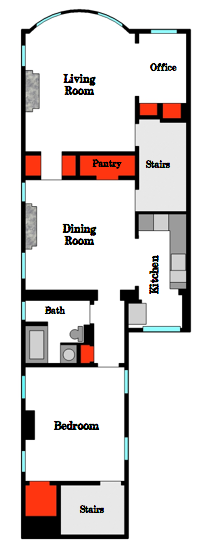
The layout of the 7 closets, highlighted in red.

There are seven closets squeezed into my condo’s 960 square feet. None of these seven closets are particularly big – the biggest of them, the closet that I converted to a pantry during the kitchen renovation, just barely qualifies as a walk-in. But still, it’s a lot of closet space for a relatively small condo. Before moving to my current place in East Boston, I lived in Boston’s North End for three years in a series of tiny apartments with postage-stamp sized closets. Even with a dresser for extra clothes storage, fitting all of my clothes and all of Mara’s clothes into a tiny closet was a major challenge. There definitely wasn’t any leftover closet space for non-clothing items. So when I first moved into the condo, I was really excited to have a seemingly endless amount of closet space.

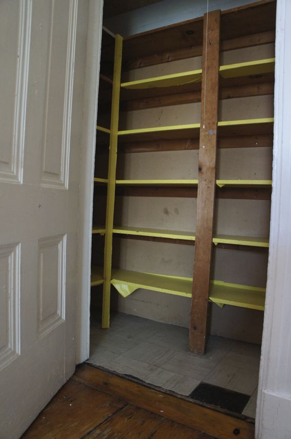
But once I actually started unpacking, I realized that most of the closets were in terrible condition. They were covered in a thick layer of grime and many of them were unfinished. It was as though someone got halfway through renovating the closets and lost the will to go on, leaving them with unfinished wallboard and makeshift plywood shelves. I quickly learned that cleaning decades-old, raw plywood and unfinished wallboard is a losing battle. The shelves in some of the closets had been covered in contact paper – clearly a last-ditch effort by a previous tenant to  create a clean storage surface. But by the time I moved in, the contact paper was peeling and filthy. A few of the closets were so bad that they weren’t really suitable for storing anything that I wanted to keep clean. They looked like the kind of storage space you’d find in a garage or a shed. And at first, that’s exactly how I used these closets, as sort of en-suite sheds. They were filled with tools, construction materials, and not much else. Here’s a picture of the pantry before I renovated it this past year to give you an idea of what I was dealing with.

Pantry Before

A lot of the closets were in rough shape, but the two closets that flank the short hallway connecting the living room and dining room were some of the worst. They were dusty and grimy and were closed in with unfinished louvered doors. And the hallway outside the closets wasn’t much better. The walls, the ceiling, and the trim were covered with a single, streaky coat of mayonnaise-colored paint. On top of everything, the overhead light fixture was dead, making it impossible to see inside the closets after dark, which may have been for the best given the sorry state of the interiors. Here’s an old picture of the hallway, taken from the living room. And yes, that cave-like hole in the wall contains the hallway and closets in question.

Hallway Before

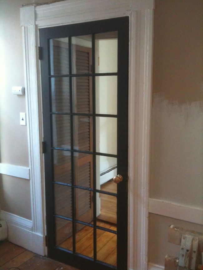
Over the past few months I’ve slowly begun to improve the closets and the hallway. If you read my last post about the living room, you might remember that this hallway – and the entire front room beyond it – was completely sealed off when I first moved in. After the hallway was opened up to the rest of the condo, the first order of business was to find a new door for the doorway between the hallway and the dining room. Since the dining room is located in the middle of the condo, it doesn’t get much natural light. The living room, on the other hand, is one of the brightest rooms in the condo. It made sense to look for a glass-front door that would provide some separation between the rooms while still allowing light from the living room into the dining room.

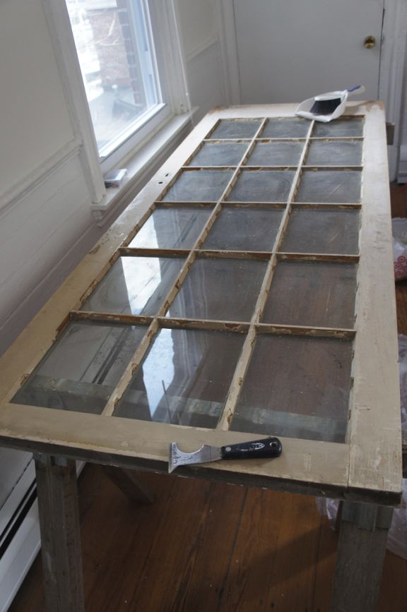
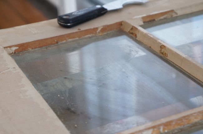
I found an old french door that was almost exactly the right size at an architectural salvage warehouse in New Bedford, MA. It was in decent condition for a salvaged door – all of the glass panes were intact. But the glazing putty around some of the glass had begun to crack and fall out. Once I got the door home, I set to work repairing the glazing. I scraped away all of the loose putty with a stiff putty knife, cleaned away all of the dust and grime, and spot-reglazed the areas of missing putty. Glazing putty takes a few days to cure and can take weeks to fully dry, so I waited about a week before priming and painting the door. Apparently, patience is important here, since painting putty that hasn’t cured provides an opportunity for black mildew to grow on the damp putty, leaving you with a permanently stained, moldy door. Pretty gross. Better to just wait a few days before painting.

French Door Before

French Door Before Closeup

Cleaning, reglazing, and painting the door was tedious, but it was nothing compared to actually hanging the door. The top of the doorframe sloped dramatically downward to one side, creating a wacky, trapezoid-shaped doorway. The whole thing was comically out-of-level, and I wasn’t sure how to go about fitting my rectangular door into such a weirdly-shaped opening. So I called in my contractor, Gregg, to help put the door up. The obvious solution was to cut the door to fit in the trapezoidal opening. But since the door contains square panes of glass, cutting it into a crooked shape would look really strange, like a distorted funhouse door. Instead, Gregg decided to level the doorframe itself.

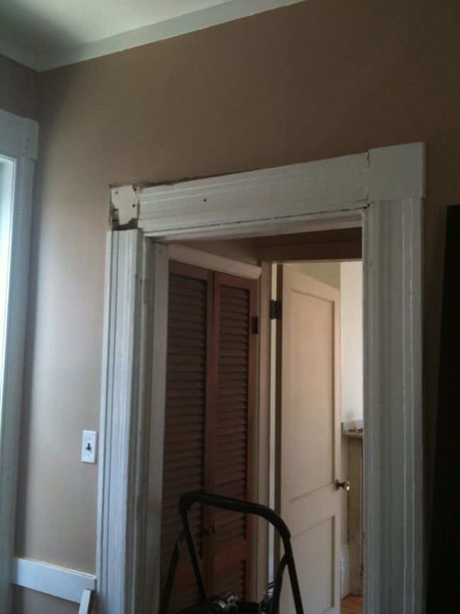
The crookedness of the doorframe was a result of the two doorjambs being different heights. Gregg used a sawzall to cut a chunk off the top of the higher jamb. Watching Gregg cut into the doorframe was like watching a risky surgical procedure. After removing the corner block from the casing around the door, it took him nearly an hour to cut through the dense, 165-year-old oak framing. He cut the jamb on a diagonal so that the lintel would fit together with the cut end of the jamb. And luckily, once the jamb was cut down to size, it only took a few taps with a rubber mallet to knock the lintel into place.

Leveling the Doorframe in Progress

Once the doorframe was square and level, hanging the door was easy. We trimmed a few inches off the bottom of the door, attached the hinges, and popped the door into place. By the way, a helpful hint if you ever find yourself hanging a door – especially a really heavy, solid wood door: put a pry bar under the door to use as a lever; lift the door by stepping on the end of the pry bar, leaving your hands free to guide the door into place and screw the hinges into the doorjamb.

The finished door

Before the new door was in place, the living room and dining room felt strangely disjointed, but the new french door really unified the two rooms. Unfortunately, because the door was mostly glass, the louvered closet doors were now on full display from both the living room and dining room. I understand that louvered doors are meant to allow air flow in and out of a closet, but in my experience their primary purpose seems to be dust collection. Having louvered doors on these closets just didn’t make sense. I wasn’t planning to use the closets for anything that would require extensive ventilation and the unfinished louvered doors were kind of an eyesore. They didn’t fit in with the rest of the condo’s architecture.

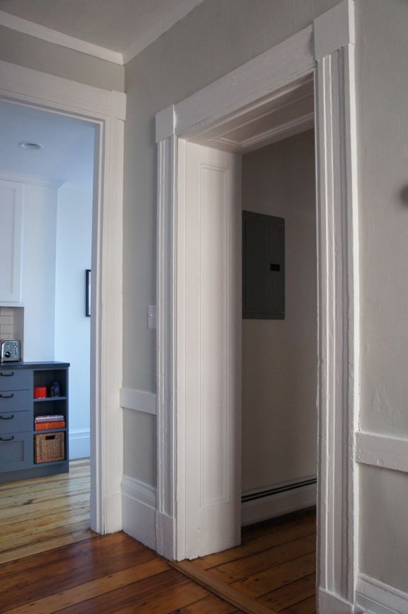
On the opposite side of the dining room, there’s an original doorway that’s surrounded by inset wood paneling.

Paneled Doorway

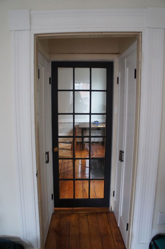
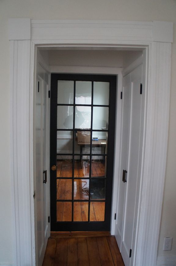
I wanted to replicate the look of this doorway in the short hallway between the living room and dining room. So I decided to replace the louvered closet doors with single-panel double doors. I looked for salvaged single panel doors, but came up empty handed and ended up ordering two sets of new doors for the closets. The narrow double doors weren’t a stock size, so they had to be special ordered. It took a few weeks for the doors to arrive, but once they were installed, the hallway finally started to look like it belonged in the condo.

SONY DSC

SONY DSC

After I replaced the closet doors, the hallway needed to be cleaned up and painted. But at this point, I had bigger fish to fry. The kitchen renovation was in full swing and was demanding all of my spare time. So the hallway and closets remained dull and dumpy for weeks – months, really. Until this past week when I finally got around to finishing them. I painted the hallway trim and walls the same bright white as the doors. Eventually I’d like to do something nicer with the trim and casing around the closet doors, but for now, a fresh coat of white paint made the space look clean, finished, and all-around presentable.

Hallway After

Hallway After

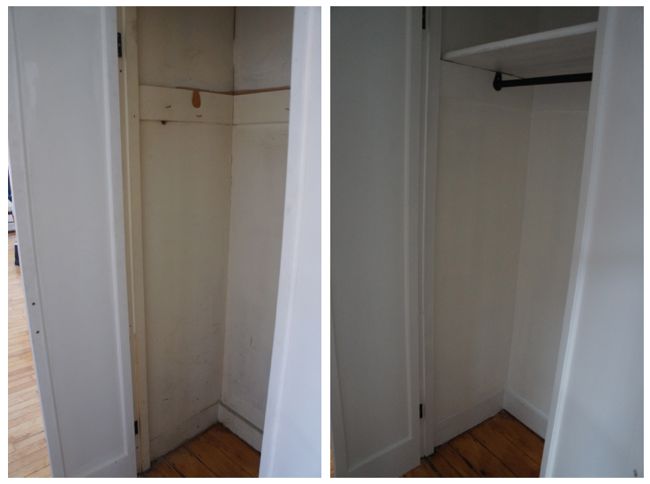
Mara and I decided to make one of the closets a coat closet/seasonal clothes storage closet. But like so many other closets in the condo, the interior of the closet was filthy and unfinished. As it was, I wasn’t comfortable putting a coat anywhere near this closet.

Closet Before and After

The coat closet before and after.

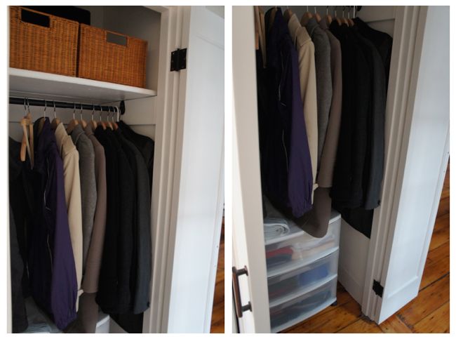
The drywall in the closet was never properly taped and finished, so I spent a few hours last weekend patching, taping, and sanding all of the interior walls. After priming and painting the whole mess, we moved a bunch of coats and winter clothes into the closet, which freed up some valuable space in the bedroom closet. It was hard to get a good picture of the finished coat closet since it’s such a tight space, so here’s two pictures that hopefully tell the whole story.

Coat Closet

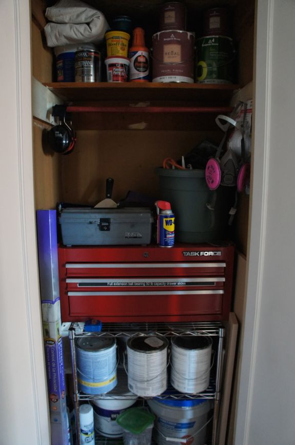
The closet opposite the new coat closet is also a mess of unfinished wallboard and general filth. But I decided to leave it as is for now and continue to use it as an en-suite shed. As I’ve renovated the condo over the past year, I’ve accumulated a ton of tools and assorted construction materials. While the kitchen renovation was ongoing, most of this stuff was spread out across the dining room and living room. But now that I’m making a real effort to make the condo a clean, habitable space, I needed to find a permanent storage solution for the leftover renovation materials. Fortunately, everything just barely fits in the unfinished hallway closet.

Tool Closet

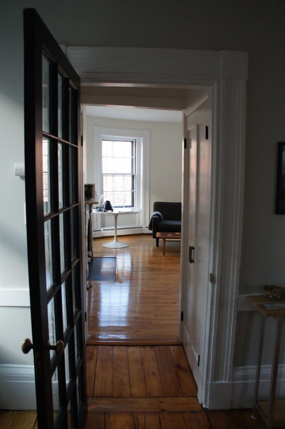
Most of the other closets in the condo still need some work. But reclaiming these hallway closets has gone a long way toward getting the condo cleaned up and organized. After living in a dusty construction site for months while we renovated the kitchen, it’s a huge relief to finally have a clean living space. On the other hand, now that all the construction stuff is gone, the condo is looking really empty.

Finished Hallway

Apr 112014
 
 April 11, 2014  Living Room 7 Responses »

My apartment now stretches across the entire second floor of my building, but when I first moved in almost two years ago, the front room was sealed off. I was renting at the time, and my landlady was using the room for storage. The only access to the room was through a locked door in the common stairwell, since the door that connects the front room to the rest of the apartment had been removed from its hinges and bolted to the doorframe. There’s something mysterious and alluring about a closed-off room, and since my sofa faced the bolted-up door, I spent a lot of time wondering what it would be like if the room were open to the rest of the apartment.

Front Room Door

At this point, I had only been in the room once, when I first looked at the apartment before renting it. My landlady referred to it as “The Blue Room”, which reminded me of the White House Blue Room I had seen on a ninth-grade class trip to Washington, D.C. This blue room, however, was decidedly less glamorous. It was piled high with boxes, paint cans, old furniture, two spare mattresses, and assorted other junk. The walls were painted the room’s namesake pale blue, but they were covered in textured wallpaper that was peeling and bubbling in places, and there were some pretty conspicuous water stains along the front wall. It looked like it had been decades since anyone actually lived in the space. Even before I signed the lease, my landlady was planning to convert the building to condos. The front room would be reunited with the rest of the apartment before it was sold, and as the current tenant, I would have the option to buy the expanded unit. My landlady assured me that she would have the front room fully renovated before selling the apartment.

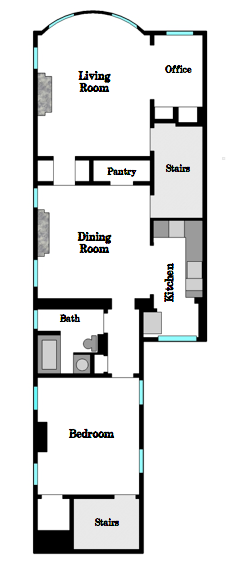
Floor Plan

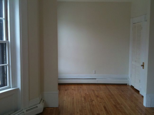
I should pause here to explain my apartment’s floor plan. The front room that I’m referring to is the room labeled living room/office in the floor plan on the left. My apartment’s long, narrow layout is similar to the layout of a lot of old row houses in Boston, with the living room in the front of the building, the dining room in the middle, and the bedroom and bathroom in the back. The front room technically qualifies as a second bedroom, but it’s the biggest room in the apartment, and I don’t really need a second bedroom. So instead, I’ve decided to use it as a living room with a small office in the side alcove.

My building was originally constructed as a single family home, and my apartment’s front room must have been one of the most formal rooms in the house. Only the front parlor, located directly below on the first floor, competes with it in terms of decorative flourishes and elegant finishes. When I first walked into the front room, I was surprised by how large and grand it was. It exuded a feeling of decaying luxury. Looking past the clutter and disrepair, I noticed the elaborate marble fireplace, the sprawling bowfront windows, the column-like window casing, the chunky baseboards, and the high ceiling. The room was chock full of beautiful architectural details. It clearly had a lot of potential, and gaining access to this room definitely played a role in my eventual decision to buy the apartment.

A few months later, renovation work began in the front room. My landlady hired Gregg Shepherd (who would later serve as contractor for my kitchen renovation) to do most of the work. The front of the building had settled over the years, leaving gaps in the exterior masonry, which allowed water to seep into the wall of the front room. The foundation was eventually stabilized and the leaks were fixed, but the interior water damage remained. Once it’s exposed to water, old plaster tends to disintegrate in a dramatic and irreparable way. So Gregg stripped away all of the damaged plaster, rotten woodwork, and loose wallpaper.

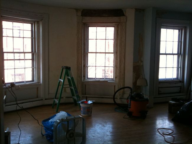
Living Room Under ConstructionUnfortunately, the only photos I have of the room from this time are dark, blurry phone pictures. But as you can see, once Gregg had stripped away all of the damage, some major chunks of the wall were missing, especially along the curved, bowfront wall. I had zero renovation experience at the time, and the whole situation looked pretty hopeless to me.

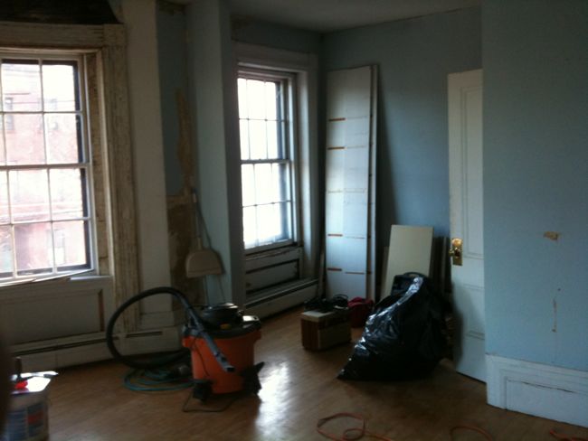
Living Room Under Construction

Gregg tried to strip the remaining textured wallpaper, but he quickly realized that it was hopelessly fused to the walls. Removing it would mean damaging the original plaster. So instead, he decided to skim coat the entire room with joint compound.

Living Room Under Construction

But before he began skim coating, Gregg replaced the areas of missing plaster with new drywall, a straightforward repair that was complicated by the fact that the bowfront wall in the front of the room is curved while drywall is unforgivingly flat. Gregg cut a series of vertical slices in the back of the drywall patch to provide it with some flexibility and then pressed it into the opening in the wall and attached it to the lath with drywall screws. He used a similar method to replace some of the curved pieces of wood trim around the bowfront windows. Finally, he used lightweight joint compound to skim coat over the repaired areas and the remaining textured wallpaper.

A few days before I closed on the apartment, I pulled down the door to the front room. Even after I removed all of the bolts holding the door in place, it remained suspended, sealed to the doorframe by countless layers of paint. I broke the paint seal with a razor blade and the door popped out of the frame.

Living Room Bowfront

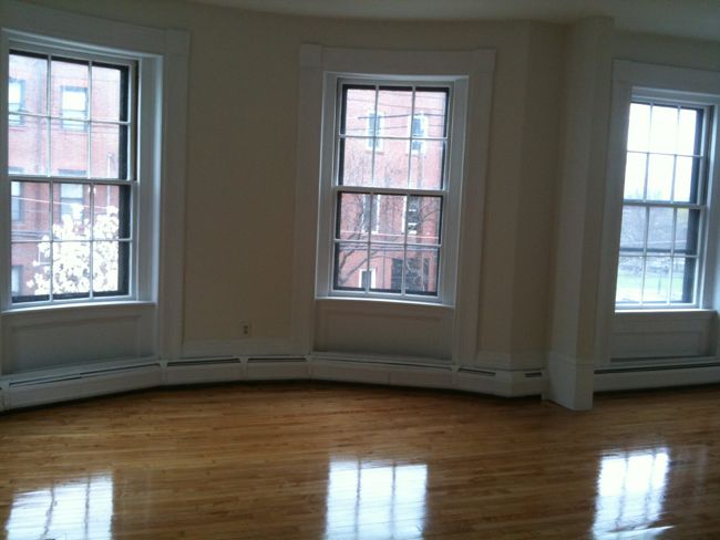
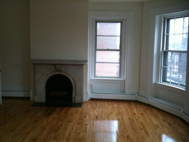
I walked into the front room and found that the “blue room” was gone. It had been replaced with a clean, crisp, white room. The walls were smooth and flat and there was no sign of water damage. The floor, which was dull and scuffed before, had been refinished, and I noticed for the first time that it was a beautiful antique maple floor. It might not be original to the building, but it looks to be at least 100 years old and was probably installed over the original wide-plank pine floor to give the room a more refined look.

Living Room After 3

You can still see soot stains on the floor in front of the fireplace, an imperfection that I think is really cool. It’s evidence of the people who lived in the building a century ago when fireplaces were likely the only source of heat in the building.

Living Room After

Living Room Window

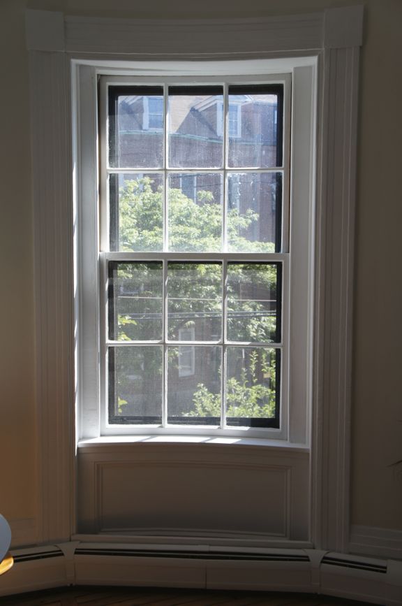
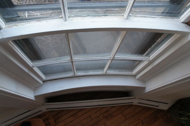
Once all of the clutter was cleared out, and the walls and trim were repaired and painted, the room’s architecture really stood out. The bowfront windows are one of the most impressive elements of the room. They’re traditional six over six double hung windows, and they’re the only original windows left in the apartment. The windows themselves are actually curved to follow the profile of the bowfront wall. The curvature is subtle and it’s only really noticeable when you look directly at the window from above.

Curved Bowfront WindowThe windows are in surprisingly good shape. They’ve been fitted with exterior storm windows, which keep out water and drafts, so hopefully they’ll remain functional for years to come.

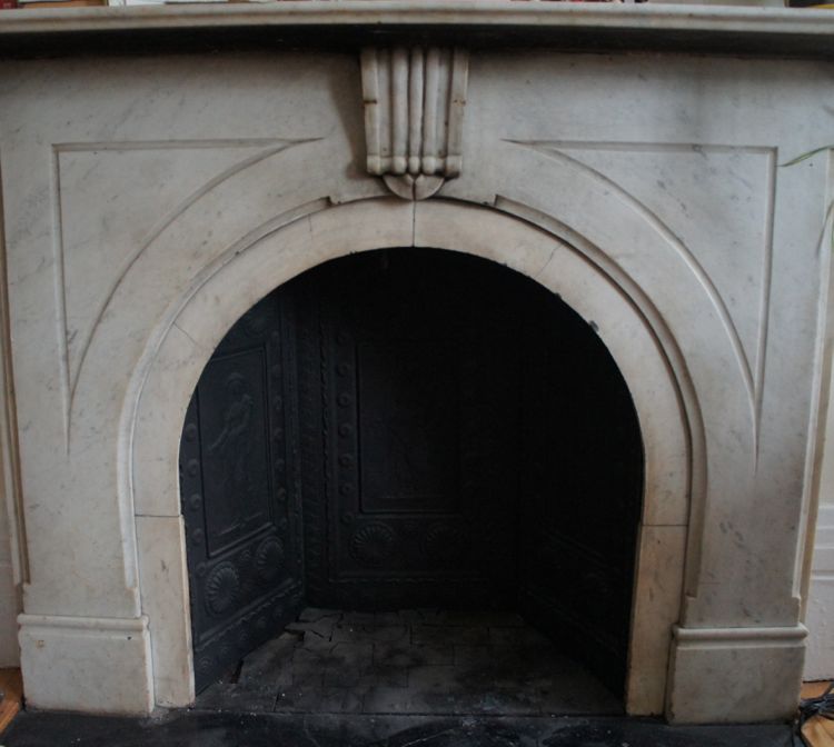
The bowfront windows are impressive, but the real focal point of the room is the marble fireplace. It’s not functional since the flue and chimney masonry are degraded, but it’s a classy addition to the room nonetheless.

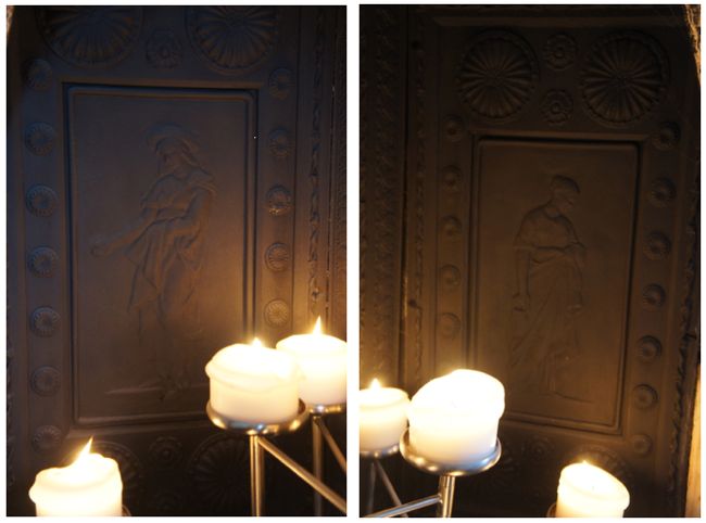
SONY DSCOne of the last details I noticed in the room was the set of three cast iron panels that line the interior of the fireplace. Each panel is a decorative relief depicting women in various poses, although I’m not sure exactly what the panels represent. One woman stands casually with a hand outstretched, perhaps sowing seeds, asking for money, or anticipating a low five hand slap. Another panel shows a woman carrying a small basket of sorts. In any case, these panels are really cool, but they’re obscured by the shadow of the fireplace most of the time. So I bought a fireplace candelabra, which illuminates the panels when the candles are lit.

Fireplace Candelabra

Fireplace Panels

I haven’t included any current pictures of the living room here because it’s a mess. Once the kitchen renovation was done, we moved a lot of the left over building materials into the living room. We’re also in the process of organizing the living room closets, so a lot of stuff that would normally be hidden away in a closet is now spread out across the room. Anyway, that’s the story of the living room to date. It’s one of my favorite rooms in the apartment and I have grand plans for it. But more on that later.

Mar 302014
 
 March 30, 2014  Cooking and Food 23 Responses »

As I renovated my kitchen over the past few months, a lot of people asked me how I managed to survive without a kitchen for so long. So for my inaugural post, I decided to answer this question (spoiler alert: living without a kitchen isn’t as bad as it sounds).

I began renovating my kitchen this past summer. Now, six months later, the kitchen has only just returned to a usable state with running water and a working stove. In the intervening months, I washed dishes in the bathroom sink and prepared countless meals using only a toaster, a microwave, and a George Foreman Grill. It was challenging at first, but I quickly adapted to life without a kitchen, and I’d like to think that I’m a better cook for the experience.

Temporary Kitchen

The temporary kitchen setup.

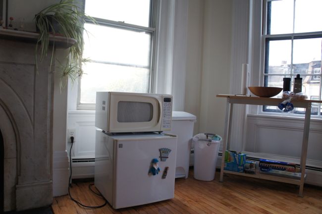
Before demolition began on my old kitchen, I set up a little temporary kitchen in my living room. It consisted of a small table for food prep and eating, an old mini-fridge, a toaster, a microwave, and a George Foreman Grill. It looked a lot like something you might find in a college dorm room. In fact, as I thought about preparing food using this temporary set up, it felt like a chance to redo my college culinary experience. Only this time I would rely less on macaroni and cheese, peanut butter, and pop-tarts and would focus on using fresh ingredients.

It was late summer when the renovation began, and it was too hot to do much cooking anyway. So I started out making a lot of cold meals. Salads with fresh produce, nuts, and cheese were an early mainstay of my kitchenless diet. Stuffed avocados were another favorite – tuna salad prepared with mayonnaise, lime juice, and bell pepper, spooned over half of a pitted and pealed avocado made for a quick, satisfying meal. Adding cilantro, green onion, dried chile, or whatever else I happened to have on hand provided some interesting variation on this basic recipe.

Without a kitchen sink or a dishwasher, I had to wash all of my dirty dishes in the bathroom sink or the bathtub. This was inconvenient to say the least. So I quickly found myself planning out meals around the amount of dirty dishes they would create. Do I really need a separate bowl for that side salad, I would ask myself. Why not just finish my bowl of rice and beans first and then use the same bowl for the salad?

As winter approached, I began to crave hot, hearty meals, and this was when the George Foreman Grill became indispensable. For a quick lunch, I often used the grill to make grilled cheese sandwiches – cheddar and sweet pickle and cheddar and apple became two of my favorite variations. And for dinners, grilled asparagus or eggplant were simple but delicious side dishes. It was around this time that I began to realize that it’s important, even without a kitchen, to dedicate time to preparing a meal. At least once or twice a week, I spent extra time putting together a meal that required multiple components. I found that the prep work and wait time involved in putting together a complex meal is almost as important as actually eating the food. Rather than just throwing something into the microwave, the extra time required to season and grill vegetables, or to put together a plate of smoked salmon, bread, and cheese, makes it feel like a proper meal.  And I’ve found that when I put extra time and effort into a meal, I also take extra time to sit down with my girlfriend to enjoy the food and each other’s company.

On the other hand, when you’re living without a kitchen, there’s the constant temptation to eat out or order in, and I gave into this temptation more than a few times. Eating out is convenient, but it’s also expensive, and eating lots of rich, restaurant food gets old fast. So I made a real effort to prepare my own meals as often as possible. But let’s be honest, not having a kitchen is a great excuse to indulge in some guilty pleasures, and there was a definite uptick in the amount of pizza, potato chips, store-bought cookies, and other junk food I consumed over the past few months.

Living without a kitchen for so long has made me more conscious of the complexity of a meal and the number of ingredients I use. For the past few months I’ve focused on preparing efficient, simple, satisfying meals. And even now that I have access to a brand new, well-equipped kitchen, I plan to continue this focus on simplicity in my cooking. Of course, it will be fun to make some more complicated meals. But there’s a lot to be said for being able to quickly put together a meal after a long day at work using just a few ingredients.