It wasn’t until I’d finished painting two and half walls and taken a step back to admire my work that I realized I’d made a terrible mistake. I had spent the past few weeks struggling to choose a paint color for the stairwell walls. I sifted through dozens of paint chips searching for the perfect greenish gray color. I bought sample pots and covered the stairwell in so many earth-toned swatches that the walls began to resemble military camouflage. I tried to imagine what each small sample paint patch would look like if it spread out to envelope the entire space. And finally, I made what I thought was a safe, reasonable choice. But now, with almost half the walls in the entrance hall painted, it was clear that my choice was all wrong. The paint was just too dark.
The color was Benjamin Moore’s Horizon Gray, a color that the paint swatch and a Google image search had led me to believe was a lovely, misty gray with green undertones. But here, in the back corner of the entrance hall, a space almost completely devoid of natural light, the color looked lifeless. It took on a dull, mossy cast, absorbing and suffocating what little light was available. The dark color accentuated the hall’s narrowness, making the walls feel as if they were closing in from all sides. (As much as I’d love to share a photo of the offending paint, all photographic evidence of this debacle was lost to a corrupted memory card. Maybe it’s for the best.) I put down the paint roller, cleaned out the paint tray, and went back to sifting through paint swatches.
One week and three or four sample paint pots later, I settled on a new color. I originally looked at mid tone colors, but I now knew that I needed something much lighter. And anything with brown undertones was out of the question since it would turn muddy in the low light of the stairwell. Eventually I decided on a color called Shaded White by Farrow and Ball (I had it color matched at Home Depot since $100 per gallon paint wasn’t in the budget this time around), which is a slightly warm, true gray.
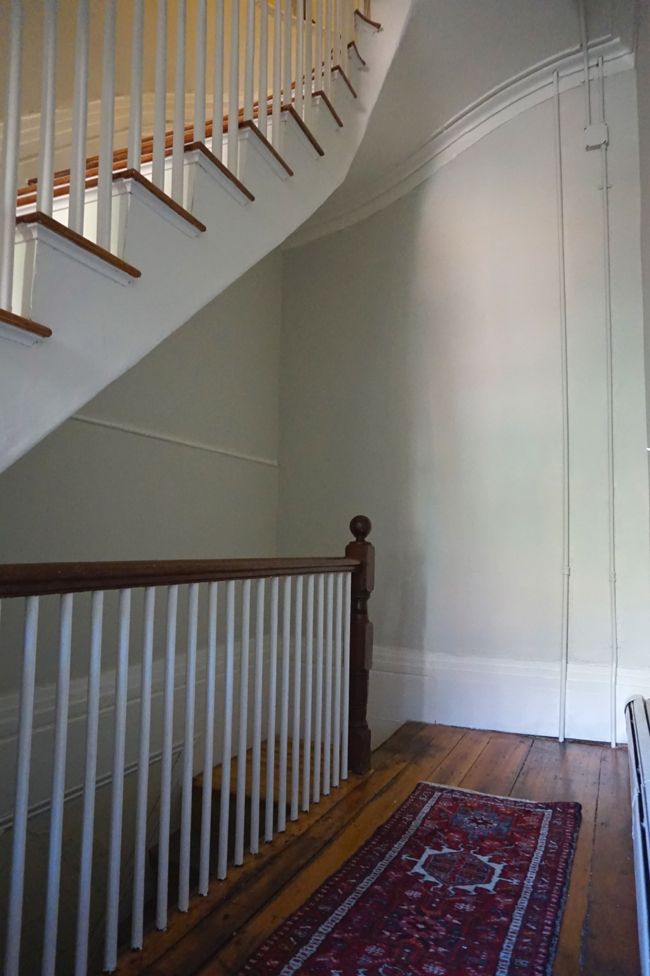
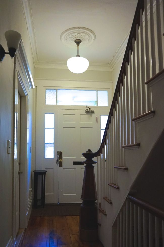
As I began to roll the new paint onto the walls, I wondered if it was too light, but as it dried, it darkened slightly. I’m happy with how it turned out. The architecture of the stairwell and entrance hall seems like it was meant to convey a sense of grandeur, lightness, and air, and the new, lighter paint color, I think, contributes to this effect. Here’s a look at the notorious back corner of the entrance hall:
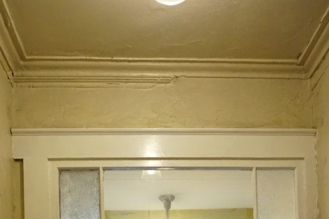
After spending two weekends painting three stories worth of stairwell walls, I was ready to tackle some of the remaining unfinished details. First up: repairing the plaster cornice above the front door. Most of the lower portion of the cornice was missing along this wall. Ornamental plaster work like the entrance hall cornice can last hundreds of years if it’s well cared for. But it’s also very delicate. A leaky wall or roof can destroy a decorative cornice or ceiling medallion within hours. And as a building shifts and settles, plaster work can crack and break away from the walls and ceilings. So it isn’t all that surprising that small portions of the cornice are missing from the entrance hall. You can see the missing portion of the cornice on the right here. The grooved bit on the left is a piece of wood that someone nailed to the cornice for unknown reasons.
Back when the building was built, the cornice was probably run in place, as opposed to casting it in a workshop and attaching it to the wall and ceiling in pieces. The process of running a cornice starts with cutting the cornice profile from a piece of sheet metal to create a custom blade. Then, after roughly troweling plaster into the corner between the ceiling and the wall, a plasterer runs the custom blade across the wet plaster, leaving the cornice profile behind. Using this method, a plasterer could have easily created a cornice that follows the curves of the stairwell in my building’s entrance hall. This is a 19th century technique that requires a great deal of skill and craftsmanship, and these days, now that walls and ceilings are made from sheetrock and moldings are made from wood, it seems to be pretty rare. But there are at least a few people out there still doing it. Here’s a video showing how the process works.
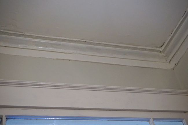
Luckily for me, the plaster cornice above the front door was mostly intact. Only the lower portion consisting of a flat, rectangular run of plaster was missing, so there was no need to redo the entire thing – something I have neither the skill nor the patience to do. I used hybrid plaster, a one to one mixture of premixed joint compound and plaster of paris, to recreate the missing part of the cornice.
It took a while for me to figure out the best way to make a clean, sharp edge as I applied plaster to the wall so that it would match the bottom of the surrounding cornice. Here’s what I came up with. Using a level to make sure it wasn’t crooked, I screwed a 1 x 3 board to the wall so that the top of the board was even with the bottom of the surrounding cornice. The board formed a little shelf to temporarily hold the wet plaster in place as it hardened. I used a putty knife to apply plaster between the board and upper part of the cornice, building it up in layers and smoothing it out as it hardened. There’s a curved groove between the upper and lower parts of the cornice, so I used the handle of the putty knife to dig a channel in the wet plaster. Once the plaster had set up (hybrid plaster takes about 10 minutes to harden), I removed the 1 x 3 board and patched the screw holes in the wall. Having limited experience working with plaster, I’m pretty pleased with how it turned out – it blends right in with the rest of the cornice.
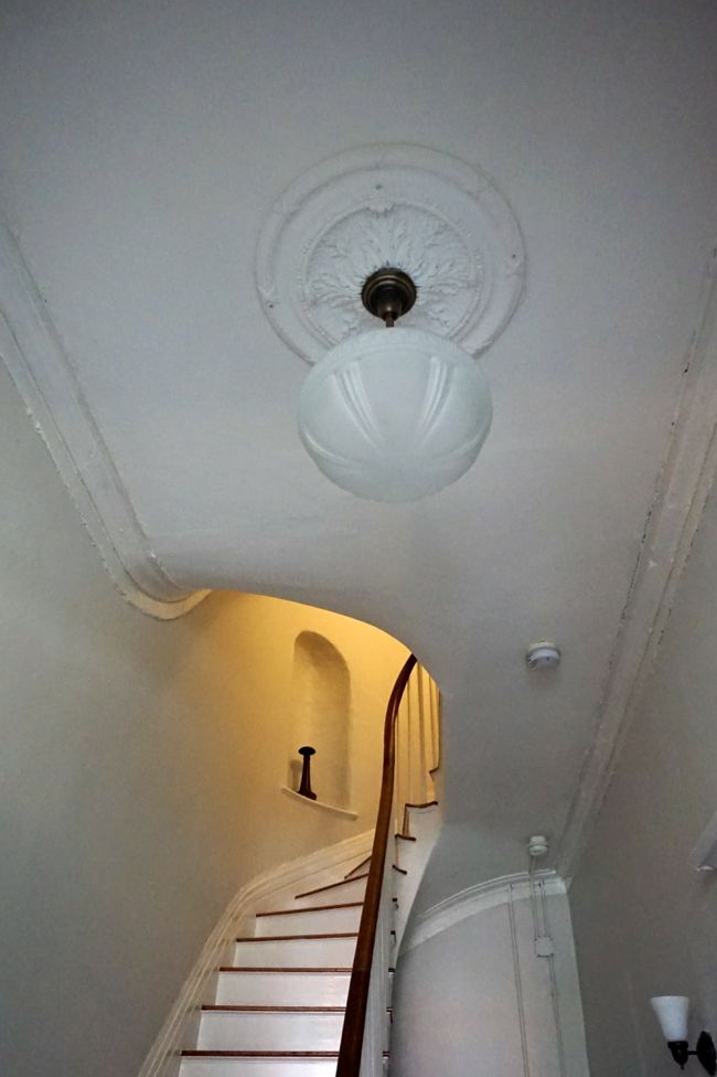
And speaking of ornamental plaster, I’ve always felt like the entrance hall was missing a fancy, plaster ceiling medallion. Back when the building was built as a single-family townhouse, the entrance hall would have been designed as one of the most public spaces in the house, featuring some of the house’s most ornate architecture, likely including a large, decorative ceiling medallion, as a way to impress visitors. At some point, perhaps when an overhead light fixture was installed, the ceiling medallion (if it ever existed) and the surrounding plaster ceiling was torn down and replaced with sheetrock. Today, the entrance hall is still one of the most public spaces in the building, and although my neighbors and I may be less concerned with flaunting our wealth and status than the building’s original, 19th century owners, I figured that adding a ceiling medallion would complement the cornice and make the entrance hall feel more complete.
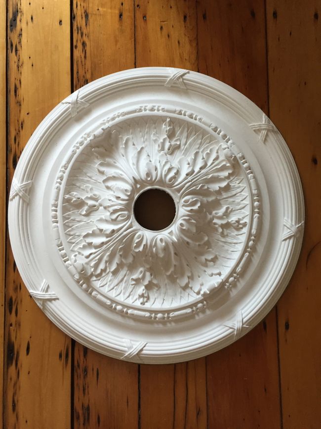
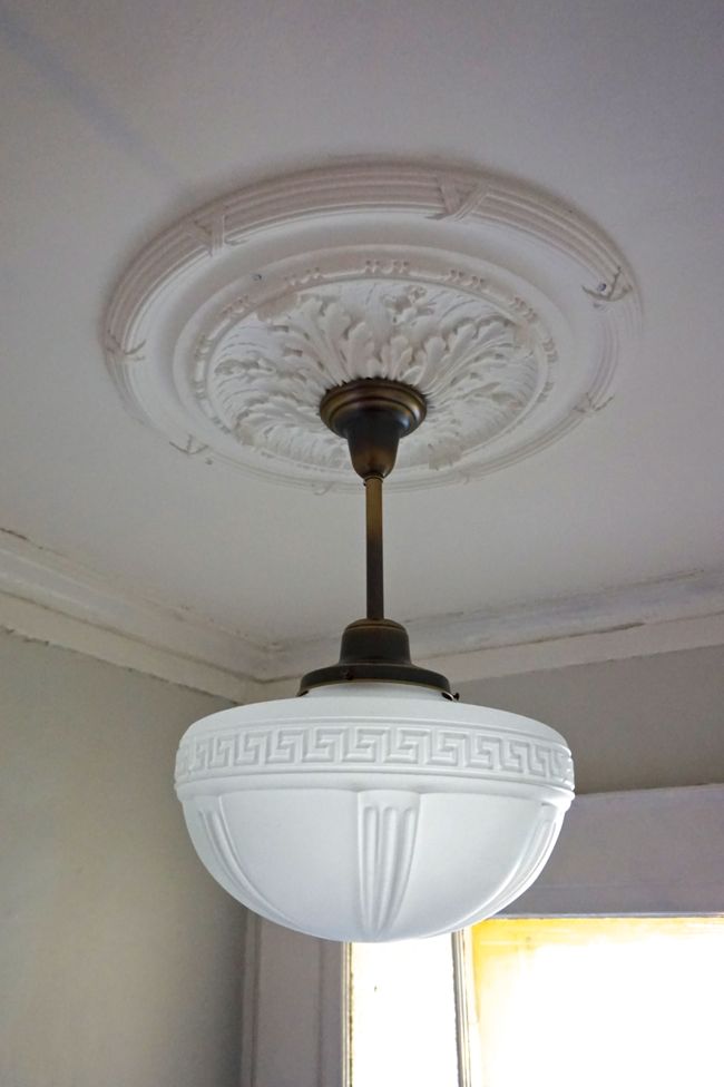
I’ve used reproduction foam medallions in the past, but I recently came across a company called Boston Ornament that casts plaster medallions to order. And their plaster medallions are about the same price as some of the higher quality foam reproductions. I ordered a 26-inch diameter, acanthus leaf medallion – a classical motif that should fit in with the building’s Greek Revival details – with a 3.5 inch hole cut in the center to accommodate the light fixture.
The plaster medallion was quite a bit heavier than the foam medallions I’ve used in the past, so simply gluing it to the ceiling wasn’t going to cut it. Instead, I used four 2-inch drywall screws to secure it to the ceiling joists. I painted the medallion with watered down paint and primer and predrilled pilot holes for the screws. I traced the medallion on a piece of cardboard and cut out a template, which I used to make sure the the screw holes matched up with the ceiling joists. And finally, I screwed the medallion into place. The whole process was easier than I expected. I covered the screw heads with painters tape before spackling over them to make it easier to remove the screws if we ever need to get at the ceiling electrical box.
Finally, I installed a new, bigger light fixture. It’s a pendant fixture from Rejuvenation with a large fitter shade that I found on eBay, which as it turns out, seems to have originally been from Rejuvenation as well. This larger, pendant fixture seems to be more in proportion to the hall’s 12-foot ceilings than the little flush-mount fixture that was here before.
The stairwell project has officially crossed the one year mark, but it’s really close to being done. All that’s left is some touchup painting and sealing the newel post and handrail. This space has come a long way over the past year. Next up, a before and after post!

Congratulations on a job well done! And that is an understatement. The tenacity you have shown through this whole restoration is amazing and inspiring.
Thanks – this restoration project has been a lot of fun (in large part because it’s not located in my main living space!)
I love seeing your progress. The results are amazing. It would be so satisfying to walk in that door every day and see the transformation. Great work!
Thanks! Thinking back to where we started, it’s been a massive change for the better. Walking through the front door every day is so much more enjoyable.
Your attention to detail and historical authenticity is to be applauded. This is amazing. While most people would have said, “hell I’m almost done and the paint looks awful, but hell no one will know/care”. Thank you for caring, the new color is beautiful. Well done!
That’s funny, my neighbor had the same comment – if he had been painting he would have said ‘screw it’ and stuck with the dark color. But I’d really only invested $30 in a gallon of paint and an hour of painting time when I realized I’d made a mistake. And I couldn’t imagine walking through the front door into such a dark, depressing space every day. Choosing a new color was definitely worth it!
This looks lovely! What a wonderful project. And I love the paint color. 🙂
My husband and I have decided that your building definitely had double doors (with a transom window) when it was built. The glass around the current door serves to fill in the area where the doors would have been.
I’ve seen similar “fill-ins” in the South End, where we live.
I love the South End – you live in a beautiful neighborhood! I thought the same thing about the single vs. double doors for a long time. I even used some of the front doors in the South End for inspiration when I repaired and repainted the exterior of my building’s front door.
But as I’ve looked more into the building’s history, I found that it was built a decade or two earlier than most of the South End bowfronts, and it seems to be closer in style to some of the Greek Revival bowfronts that were being built in Beacon Hill around the same time – especially the buildings around Louisburg Square, most of which have a single front door with a transom and side light windows. Apparently, the double doors on many of the South End bowfronts are associated with the Renaissance Revival and Italianate styles that came into fashion in the 1860s.
My building’s current front door and the surrounding transom and side light windows don’t seem to be original, but the oldest photo I’ve seen of my block of bowfronts from around 1900 shows all of the houses with single doors. And given the style of the buildings, it seems likely that they’ve always had single front doors. Honestly, I think double front doors are cooler – they make for more of a grand entranceway. But we’ll probably leave our single front door as it is, both for practical reasons and to maintain the style of the building.
Aha, that makes a lot of sense. Kudos on all your design decisions, they add up nicely and it’s great to see the building shine.
It all looks so light and clean now–what a transformation! You should be very proud. I am in my own exterior paint color conundrum … just when I thought I had it all figured out. Color and light are so tricky!
I know! You’d think a test patch of paint would be a good indicator of the color of the final paint job, but in this case once a whole wall was painted, the color looked completely different. Good luck finishing your house painting — looks great so far!
Catching up on your travails a bit late sorry! You have done an amazing and incredibly thorough job. I hope your neighbours are very grateful. It’s the same colour as my bathroom!
Thanks! There are still a few little details to finish up in the stairwell… But at some point I really will do a proper before and after post for the project.
I’ve actually been thinking about using the same paint color in my bathroom as well, if I ever get around to remodeling it.