When it comes to renovating old houses, some people work tirelessly to restore a house to its original state. They relish getting all of the historical details just right – stripping layer after layer of paint from original moldings, finding period-appropriate paint colors, seeking out reclaimed lumber to seamlessly patch antique floors. Others take the opposite approach, altering the architecture to create a modern home with modern conveniences – removing walls to open up the layout, installing wall-sized windows to flood the interior with light, or adding a sleek, contemporary kitchen. And then there are those who split the difference, finding ways to add modern conveniences while preserving as much of the original architecture as possible.
Depending on the circumstances, I think each of these approaches can be appropriate, but as I’ve renovated my condo over the past three years, I’ve stuck to the third approach, doing my best to respect the building’s original architecture while adding some modern functionality. And when my neighbors and I decided to renovate the building’s entrance hall and stairwell, we decided to take this same approach.
Our first priority was improving the safety of the stairs. We decided to rebuild the staircase, replacing all of the worn treads and risers and making sure each step was even and level in the process. We chose red oak replacement treads for their durability even though the originals were pine. We also raised the handrail a few inches to bring it to a more usable height (I’m not sure why 19th century handrails are always so low – I guess people were just shorter back then?). But even as we made these major changes, we did our best to retain the spirit of the stairwell’s original architecture. We maintained the sweeping, curved shape of the staircase, and reinstalled the original newel post and handrail. We found plain balusters that approximated the originals, and we uncovered and refinished the original pine floors.  As the project progressed, and the major (re)building work drew to a close, I began to focus more on the finishing details. I had spent far more time in the stairwell after working on it for a few months than I had in the previous two years combined, and I had gained a new appreciation for the quirky “coffin corner” nook, the monolithic newel post, and the rest of the space’s original architecture. A few weeks ago, when I finished stripping the paint from the baseboard, exposing the raw pine molding for the first time in 170 years, I started thinking more and more about what the stairwell looked like all those years ago. And now that work on the entry level of the stairwell is almost complete, I’ve become fascinated by the idea of restoring as much of that original appearance as possible.
 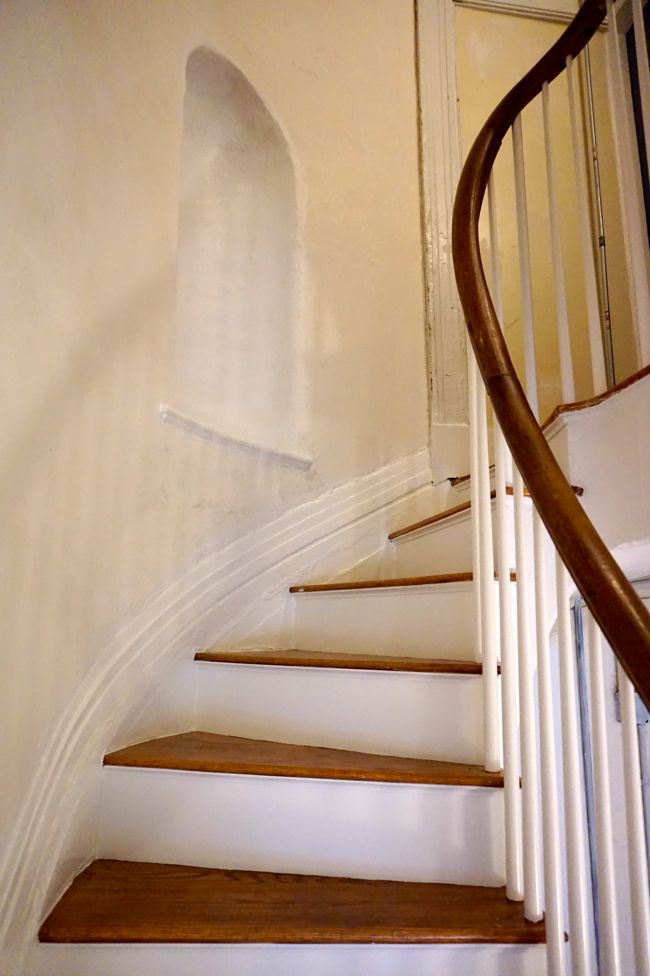 Of course I’m only willing to take this idea so far. Several doorways in the stairwell were walled up when the building was divided into apartments, and reopening these doorways wouldn’t make much sense, since the building is no longer a single family residence. Other architectural elements, like a ceiling medallion, have been lost, if they ever existed at all, and recreating them will be somewhat speculative. And I’m not opposed to using modern materials that didn’t exist in the 1840s to capture the spirit and atmosphere of the entrance hall as it was originally designed.
Luckily, the major ornamental features of the entryway and stairwell – the original molding, the “coffin corner”, the newel posts and handrail, the plaster cornice – are mostly intact. All that remains is for me to figure out how best to present these features.
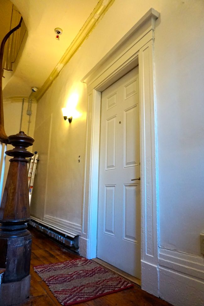
As you might have noticed in the pictures above, I’ve spent the past few weeks priming and painting the risers, the balusters, and the rest of the trim. The color is BM “Simply White.” I had planned to paint the trim white all along, but after stripping dozens of layers of paint from the baseboard, I confirmed that the final and original coat of paint was white. White trim was common in Greek Revival buildings like mine – it was meant to evoke the marble columns and facades of ancient Greek temples. But unlike the “Simply White” I chose, the original coat of paint was a creamy, yellowish white (from what I understand, true, bright white paint didn’t really exist in the mid-19th century). Even so, since the stairwell is so dark, I decided to take some interpretive license – the brighter white paint will look cleaner, and well, brighter. Here’s the freshly painted, original parlor entrance (now the front door to the parlor level apartment).
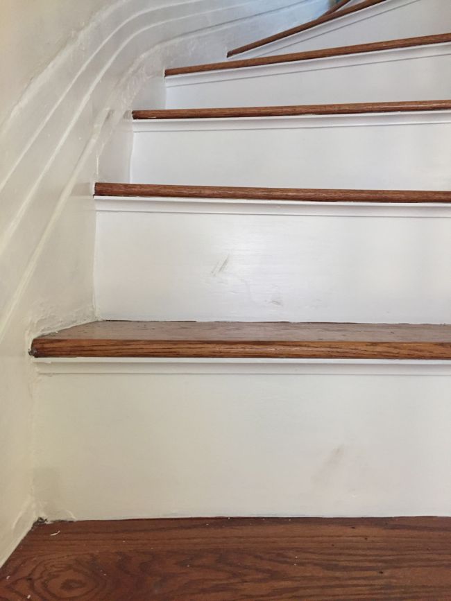
But I quickly found that bright, white paint can have its downsides. The stairs are a high traffic area, and within a few days of priming and painting the risers, dark scuffs began to appear.
This was a problem that required a modern solution in the form of crystal clear, hard-wearing, water-based polyurethane. After scrubbing off the scuffs, I added two coats of Minwax Ultimate Water-Based Floor Finish, the same poly that I used to seal the stair treads, on top of the riser’s white paint. The poly didn’t noticeably change the color of the risers, and unlike oil-based poly, it won’t yellow over time. Just as I had hoped, the new finish seems to repel scuff marks, and when it does get smudged, a quick wipe with a dry rag leaves it looking like new.
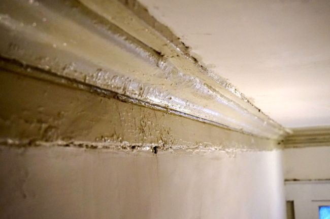
The plaster cornice, another original feature of the stairwell, is in decent shape, but needs to be patched and cleaned up. It’s a simple profile that follows the curve of the staircase. Most of it is intact, but a few small sections are cracked, or were poorly patched years ago, leaving them looking slightly lumpy, without the crisp detail of the rest of the cornice. These sections don’t look so bad from a distance, but up close, they look a little off.
I’m planning to clean the cornice and patch it with plaster of paris where needed before caulking and painting it to match the rest of the trim.
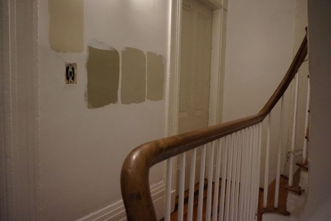
Maybe the biggest decision left to make, in terms of how it will affect the look and feel of the entrance hall, is what color to paint the walls. I’ve been agonizing over this decision for months. I’ve been thinking about painting the walls green, or gray, or greenish gray. Last week, after priming the skim-coated walls to seal the raw joint compound, I painted patches of four sample colors on the walls in different parts of the stairwell to see how the colors looked in different lighting.
The colors, from left to right, are Nantucket Gray, Horizon Gray, Revere Pewter, and Edgecomb Gray, all Benjamin Moore. Since the stairwell walls have been plastered over many times, it’s impossible to know what color they were originally painted. But earth tone paints were gaining in popularity around when my building was constructed, so it seems like a brown, gray, or green color would complement the architecture. And since the space is so dark, and the ceilings are so high, I’m hoping that a mid-tone wall color will make the space feel more welcoming. Of the four colors I’ve tried so far, I think Nantucket Gray is too dark, and Edgecomb Gray is too yellow, but I’m torn between Revere Pewter, which is a warm gray, and Horizon Gray, which has green undertones. My neighbors are more or less indifferent about the paint color, so it falls to me to make the final decision, but I’m open to advice!

Revere Pewter is the main color in my condo, and it’s amazing how it goes with everything and every color. It looks great with wood tones, and it’s crisp with white trim. So, you can’t go wrong there!
I know you were leaning away from yellow tones, but my first thought for your stairwell — looking at the beautiful trim and hardwoods — is BM’s Powell Buff. It works from basements to attics and it manages to be both cheerful and neutral.
Great blog!
I think my aversion to yellow tones in this space comes from the fact that the old, textured walls were painted yellowy-beige in semi-gloss (the trim and the ceilings were painted the same color), and it wasn’t doing the space any favors. I hadn’t considered Powell Buff, but based on a Google image search, it does look like a far more attractive color. I’ll have to look into it.
I’m with Keith on Revere Pewter. Just enough warmth…like pewter, and not too dark.
The work you’ve coordinated and done is just amazing, you are a gift to your neighbors.
Thanks! And I agree, I’m leaning toward Revere Pewter at this point – it complements the floors and looks good in dim and artificial light.
I’m afraid I won’t be helpful with the wall color. I”m a little clueless! However, we used Ben Moore Simply White on our woodwork and doors in our tiny townhouse, and after six years, I still love it. The restoration is stunning and so welcoming. As Ruth said, you are indeed a gift to your neighbors.
Glad to hear you’re still liking your Simply White woodwork. It’s already made a huge difference in the stairwell – it really highlights the molding and brightens up the whole space.
I do like yellow in a hallway/stairwell. So much that yellow is what I have in my own house’s halls and stairs. But it does seem to show dirt more than other colours and to fade when washed, which could make it a poor choice in a shared space such as this one. Love your blog and your neighbours must love you!
Thanks! Yellow must make for a cheery hallway, but since this is a common space with entrances to four different apartments (each with their own color schemes and decor), I figure it’s safest to stick to a neutral
These all look like good choices. One thing to consider: are you going to be changing the lighting in the space more? If you now have yellowy lights, but are switching to new CFL/led-based bulbs… that might change it.
Also, did you consider anything bluish gray?
That might feel cleaner than the murkier tones.
I switched out all of the light bulbs in the sconces and the overhead light for LEDs a few weeks back, so the lighting should stay more or less the same from here on out. Although, we’ll probably replace the overhead light with a pendant or small chandelier at some point, but hopefully that won’t really change the quality of the light.
My dining room (right off the stairwell) is painted BM Moonshine, which is a pale gray with bluish undertones. I like the color a lot and thought about extending it into the stairwell. But because the stairwell gets pretty much zero natural light, I was worried that bluish gray could end up looking too cold, so I’ve only really looked at warmer tones for the space.
I like the Revere Pewter also – nice and crisp looking with the white woodwork. I always look forward to reading your blog and seeing the transformation of your home over time. You have done a great job combing the old and the new.
Thanks Roxanne, I think Revere Pewter is at the head of the pack at this point.
I like both the revere pewter and the horizon gray but lean more toward the horizon gray because of the blueish-green undertones. I think it gives the walls a little more personality and feels more colonial while still being neutral.
I’m trying to pick a paint color for my tiny hallway of doors that has no window of it’s own. It’s hard to imagine what any color will look like in such a dark hallway where most of the surface area is the doors. I guess I should figure out what color to paint the doors first.
If I’ve learned one thing from looking through paint colors for the stairwell, it’s that visualizing a paint color in a really dark space is almost impossible. My advice would be to get some paint samples for your hallway before committing to one color. Choosing a few colors that complement the colors of the rooms off the hallway might be a good place to start.
And I agree that painting the doors first is probably a good idea — if you’re not going for something bold, your options for door paint colors are a little more limited (probably white or black) so it should be an easier choice. Good luck!
Horizon!
Actually Horizon at 75%.
Ever since you first mentioned the possibility of green walls, that’s how I’ve pictured your entryway, so my vote is for Horizon. Hard to say how faithfully my computer renders it, but I think it would look fresh with the warm wood and the white trim. Either way you go, it’ll look great. I agree, your neighbors are darned lucky to have you!
The idea of a green stairwell still really appeals to me, but I ended up choosing more neutral samples since it’s a common space. The Revere Pewter feels warm and welcoming, but Horizon might look more elegant and contrasts more with the wood tones… This might come down to a coin toss or something.
I vote for the Horizon – I think its greenish undertones will play very nicely with the warm wood tones.
My vote is for Horizon Gray, any time I’m in old buildings (which is a lot luckily!) and the walls have a yellow tinge I’m reminded of the nastiness cigarette smoke adds to walls so unless it’s a bright yellow it reads dirty to me.
Hello! Great work on the stairway restoration. We painted our staircase (similar house style, but in the South End) an off-green color about 15 years ago and we’re about to change the color to a pale gray, because the green (“moldy green” as my husband puts it) now seems very dingy. The color is very similar to your selections, is high-quality paint, but just doesn’t do nice things when it ages. We’re changing the color to Glidden Smooth Stone, a gray that catches light and doesn’t turn blue.
Anyway, offering this as an alternate path. Wedgwood blues age well, too (we have that in our entryway stair). Good luck!
Thanks for the heads up! I’m starting to realize that you may be right — anything other than a warm, light neutral is going to look dull and dingy in places and may only get worse over time.
Hi Dan. Any new posts coming soon?
Yes! Look out for an update later this week.