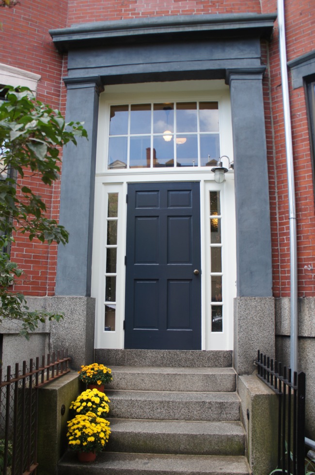
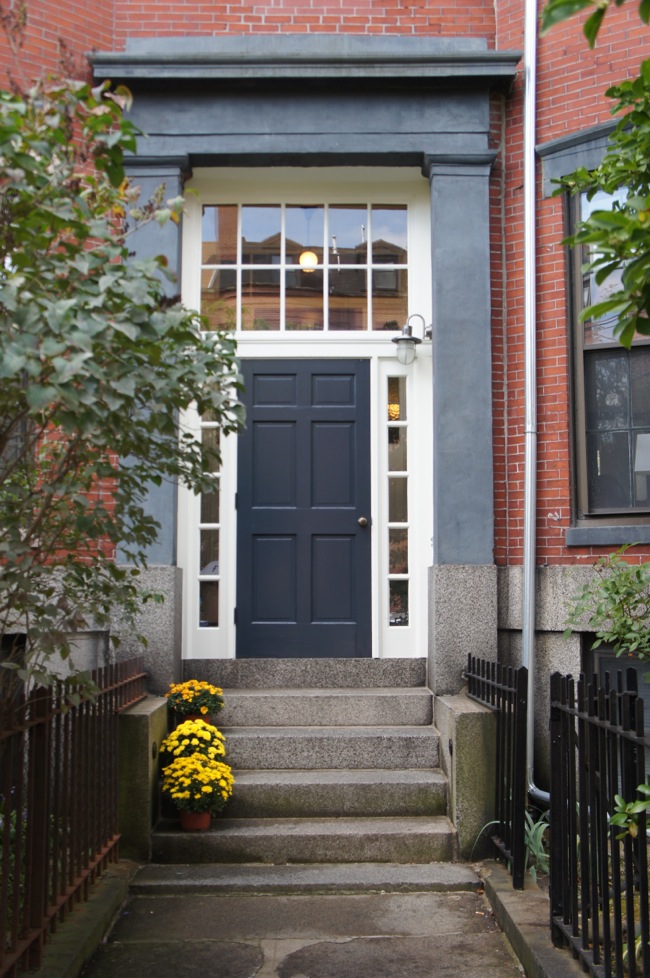
The front door is finally done, and it took most of the summer so I won’t draw it out any longer. Here’s the repaired and repainted front door:
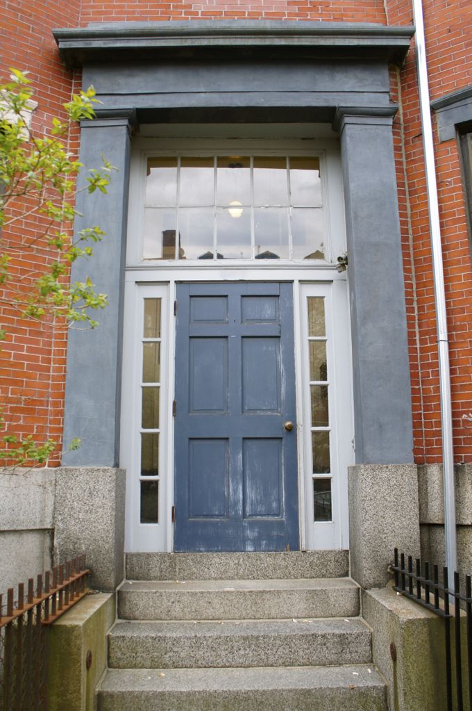
Let’s take a look at where I started a few months ago:
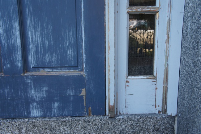
The original paint on the door and surrounding side lights and transom was chipped and flaking and had even worn down to bare wood in places. Long slivers of crumbly glazing putty were peeling away from the transom window panes. A few of the glass panes had lost so much glazing putty that they looked like they might fall out of the window frame if they encountered a stiff breeze. Clearly something needed to be done. So naturally I spent a few weeks agonizing over what color to paint the door before I started any actual work.
As you can see, I eventually settled on dark blue for the door and off white for the trim. These colors aren’t all that different from the original light blue-gray trim and medium blue door. Even though my neighbors pretty much gave me free reign to choose whatever colors I wanted, I didn’t want to upset anyone by doing anything too crazy. So I more or less stuck with the existing color scheme. I considered painting the door yellow after so many of you suggested it, and if I owned the entire building I might have gone for it. But in the end, something dark and traditional seemed like a safer choice.
Once I decided on dark blue, I had to pick a specific shade of dark blue. I’m easily influenced by the names and descriptions of paint colors, so when I began looking through Benjamin Moore colors online, I was immediately drawn to “Hale Navy,” which Benjamin Moore describes as, “a timeless classic, this deeply saturated shade of navy blue evokes rich maritime traditions and storied exploits at sea.” Do I want my front door to recall storied exploits at sea? Well now that you mention it, yes, yes I do. I was sold. Until I came across “Washington Blue,” the description for which reads, “suggesting gentility and culture, this deep, lush navy blue is based on the color created by hand-grinding Prussian blue in oil.” You had me at gentility and culture.
But after I picked up paint chips in a few different shades of dark blue at the paint store and held them up to the door, the Washington Blue looked too green in comparison to the blue-gray portico, and Hale Navy didn’t look dark enough. Instead I chose Polo Blue, which despite its preppy name, is a simple, inky blue-black. For the side lights and transom I chose French Canvas, a grayish off white that echoes the color of the building’s mortar.
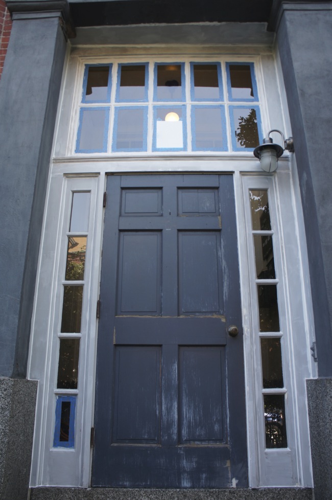
Before I could start painting the door and trim, there was a long list of prep work to complete. I began by reglazing the transom window. I then moved on to the soul-crushingly-tedious work of scraping away every last bit of loose and peeling paint. Whoever originally painted the door apparently didn’t believe in the merits of priming raw wood before painting. So there was a seemingly never-ending amount of loose paint that needed to be scraped – a boring, awful process that took forever.
Once all of the loose paint was gone, I washed everything down with a sponge and soapy water followed by clean water. I let everything dry for an hour or so and then primed. I used a primer called Peel Stop Triple Thick made by Zinsser. As the name suggests, this primer is really thick. It’s designed to even out the surface of weathered wood, and again, as the name suggests, it’s supposed to prevent patches of old paint that are still adhered to the wood from peeling further. It goes on smoothly, and judging by how well it stuck to my hands, it binds tightly to the underlying paint and wood, but we’ll see how it holds up over time. I used an exterior oil based primer to prime the new glazing on the transom window (since the glazing itself is oil-based, an oil-based primer is needed to seal it).
After everything was primed, I caulked all of the seams in the trim. The side lights, transom, and trim had never been caulked before, which allowed water to seep into the cracks between pieces of trim, and was probably part of the reason why the trim was weathering so poorly. The caulk will help protect the trim from the elements, and as an added benefit it gives the whole entryway a more finished, seamless look.
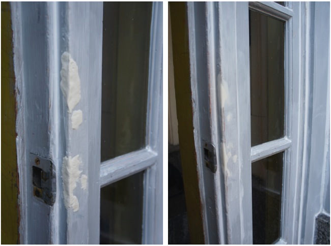
The bottom of the door and the edges of the door frame had sustained some pretty serious gouges over the years, so before I moved on to painting, I repaired the corners with wood filler. I used WoodEpox, which is a two part epoxy. It’s really easy to work with – just grab approximately equal sized chunks of each component and mash them together in your hands (preferably while wearing gloves). Then press the paste-like epoxy into the gouge, leave it to dry for a few hours, sand, and paint. WoodEpox is supposed to stay in place even on exterior wood that expands and contracts with changing weather, so we’ll see how it holds up. Here’s a corner of the doorframe that I repaired after applying the wood filler (left) and after sanding (right).
Finally, I painted everything, which ended up being one of the quickest and most enjoyable parts of the entire project. I used Benjamin Moore’s exterior latex paint in soft gloss. It’s a nice, thick paint, and I only needed two coats to fully cover the door and trim. I considered Benjamin Moore’s “Grand Entrance” paints, which are their specialty front door paints. But the “Grand Entrance” paint is oil-based and the guy at the paint store convinced me that latex paint is just as durable as oil paint and, unlike oil paint, it won’t yellow over time.
The hinges on the door were completely rusted out, so once both sides of the door were painted, I took the whole thing down and removed the hinges, sanded them, and painted them with Rustoleum rusty metal primer and enamel topcoat. There are these big, rusted, iron bolt and washer things clamped to the granite on either side of the steps, so I decided to spray paint them while I was at it. I used a plastic drop cloth and painters’ tape to seal off the granite while I painted.
The door is solid wood and it’s really heavy, so Mara and I had a miserable time rehanging it. Since it opens onto the steps, it’s impossible to balance the door in the doorframe while screwing the hinges into the doorjamb. Instead I had to hold the door and try to maneuver it into place while Mara screwed the hinges into the jamb. We got it eventually, but it was an ordeal.
So there it is, the finished door. I still need to order a brass address plaque, and I’d also like to get a pair of brass toe kicks, but otherwise it’s done. I think it turned out nicely, and the neighbors seem to like it too, so we’ll call it a success. And even though I didn’t use “Hale Navy” in the end, the dark blue door with brass hardware surrounded by white trim has a definite maritime character, which seems fitting for a building located on the harbor in East Boston, a neighborhood that has historically been associated with the shipbuilding industry.

Looks great! We too chose a dark navy for our front door. It unfortunately is very purple at night. Yours looks great!
Aren’t you tempted to have another light on the other side, for symmetry?
I hadn’t really thought about it, but two sconce-like fixtures on either side of the door would probably look very nice — and symmetrical. But I’m pretty sure there’s no electrical in the opposite wall, so unfortunately it’s a project that probably won’t happen any time soon.
I like the asymmetry. The light is on the functional, door-opening side and the pots are on the less-used side. The pots and the lamp seem to balance, at least in the shot/s we see.
Nice work!
I really like the asymmetry as well. The front door is beautiful.
I love your projects – they always come out great, and this one is no different. Congrats!
Great job! Looks amazing and love that paint color!
It looks great. And I’ve pinned the paint color. 🙂
Wow–really nice. I bet it feels good to have all that work behind you!
Thanks, Susie! It feels like I’ve been working on this project forever, so it’s definitely nice to be done!
It came out so nice. The deep blue looks terrific and so do the windows. It sounds like a lot of hard work went into the project. Congratulations.
I’m so glad you finished it.
Prep is 90% of any job and you seem to revel in doing it right which is refreshing in its own right.. I’d love to walk by that front door every day and smile.
Well done!
I too appreciate the care you put into prep and a job well done. It looks beautiful, and will be a great backdrop for pretty entryway plants across the seasons (like those mums). Toe kicks and address plaque will also look beautiful with those colors. Congratulations!
Yes, I’m looking forward to keeping some plants out front! I haven’t decided if there’s enough room, but it’d be nice to have a permanent planter out there.
Looks terrific! You added a lot of value to everyone’s condos!
“it opens onto the steps, it’s impossible to balance the door in the doorframe while screwing the hinges into the doorjamb. Instead I had to hold the door and try to maneuver it into place while Mara screwed the hinges into the jamb. We got it eventually, but it was an ordeal.”
Next time you have to remove the door, put a couple of blocks (different height) on each step to balance the door, instead of holding it. Mine is even taller and wider and heavier than yours, I sprayed it with the same BM Grand Entrance, similar color (Dunn Edwards’ Dark Bay). But because of exposure to heat and humidity, expansion and contraction have already taken a toll on the seams of the panels.
Using blocks to support the door is definitely sound advice! Sorry to hear the new paint isn’t holding up on your door. I actually ended up using BM exterior latex paint instead of the BM Grand Entrance, which is oil-based. The guy at the paint store convinced me that latex paint retains color better than oil and resists cracking longer. And a year later, the paint seems to be holding up well — no cracks or chips, even around the door panels.
The BM Aura Grand Entrance is an enamel, which is harder than acrylic – and that is the problem. Enamel dries to a very hard surface but that comprises flexibility, thus is not as sticky as acrylic (as if it never cures/dries). BM Grand Entrance I used is water-based. I believe the trick is to use latex (acrylic) for outdoor surface, its properties hold up better to the elements and wood surface.
Thank you for taking the time to document and share these projects. I was just googling around trying to learn the difference between row homes, townhouses and brown/grey stone homes when I found your blog and fell in love with the door & transom projects. Amazing results!
Thanks! The differences between these types of housing is a little confusing since they’re all related. For what it’s worth, my building is a row house (it’s attached to a row of identical buildings on my block), and was originally a townhouse (a single family house in the city), and many people in Boston would also call it a brownstone. Although, since it’s mainly made out of brick with brownstone (sandstone) lintels and door surround, many New Yorkers would take issue with this name (New York brownstones have a facade completely made of brownstone). It’s probably more accurate to call my building a brick bowfront (a building with a curved window bay in the front, common in Boston). Hopefully I haven’t muddled the issue more for you…
As a heads up, we have some more exterior restoration projects planned over the next few months (hopefully before winter sets in) that I’m hoping to document here. So you’ll have to check back in!
This web site truly has all of the info I needed concerning this subject
and didn’t know who to ask.
I read this piece of writing completely about
the comparison of most recent and previous technologies, it’s awesome article.
Late to the game here, but thank you for this post! I was trying to find a navy for our front door, and Hale Navy turned oddly purple-toned in our light. Washington Blue was a shocking bright blue that looked completely different from its pretty swatch! I was beginning to despair of finding a true navy when I found your suggestion for Polo Blue. On the swatch it looked almost black so I doubt I would have tried it had I not seen your picture. But it worked perfectly in our light and was exactly the color I was seeking.