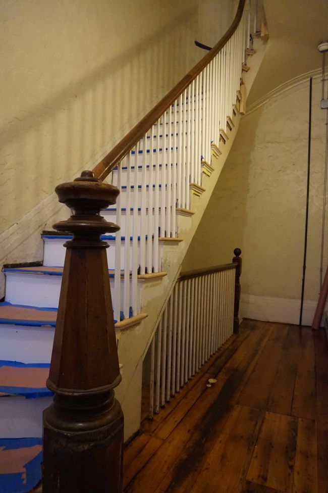
Work on the stairwell has reached a point where it’s possible to imagine the finished space. Gregg is almost done with major construction work, and I’ve started to think about finishing details. Should we hang a mirror by the front door? Do we need an umbrella stand? What kind of runner should we get? And especially, what color should we paint the walls? Of course, there’s still a ton of work left to do (not least skim coating all of the walls in the stairwell) and thinking about this kind of stuff is really just a form of procrastination. But with that said, let’s indulge in some procrastination, shall we?
As you may have noticed after looking at countless poorly-lit photos of the stairwell, the space doesn’t get much natural light, which makes choosing a paint color for the stairwell walls tricky. Ideally, the wall color would look good in artificial light and strong shadows. Since the space is so dark, my first impulse was to brighten it up by painting the walls white. But I’ve since noticed that white walls can look cold and dingy in low light. So my next choice was to paint the walls gray. A warm gray would probably look best, but the question is, how dark? Should we fully embrace the shadows and go with a medium or dark gray, or should we stick with something lighter? I can’t decide if a dark gray stairwell would feel warm and inviting or scary and imposing.
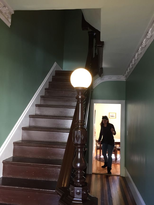
I was still undecided on this question when I went to an open house in the Eagle Hill section of East Boston a few weeks ago. We’re not actually in the market for a new house, but checking out other people’s houses is always fun. This particular house was a wood-frame, Second-Empire-style, detached, single family town house built in 1870. Here’s the house’s front stairwell, just inside the front door.
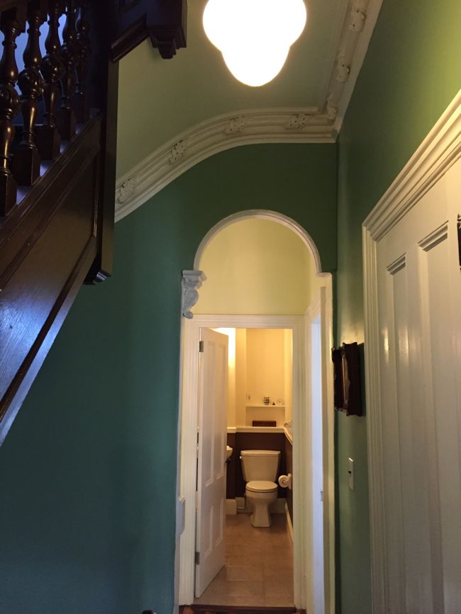
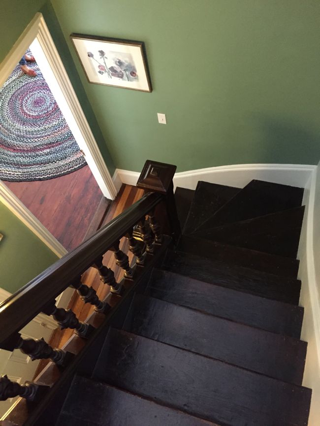
After you’ve taken a good look at that amazing hybrid newel/lamp-post, the alternating fir/pine pin-striped floorboards, and the giant crown molding decorated with intricate, plaster acanthus leaves, you might notice that the walls are green. Here’s a few more shots of the stairwell:
The stairwell wasn’t quite as dark as ours, but it wasn’t far off. The walls were a medium green, and although this particular shade of green might not have been my first choice, it looked good. The green set off the white trim and complemented the dark wood staircase. By the way, the rest of this house was as incredible as the stairwell – Mara had to talk me back from making an offer on the place (but don’t get too excited, it sold the day after the open house).
Since I saw this stairwell a few weeks ago, I’ve started thinking of our imaginary finished stairwell as green also, which is a little strange for me since I put so much work into removing every trace of pea-green paint from my bedroom and kitchen. But a more subdued shade of green in the stairwell would actually be in keeping with the building’s mid-19th-century roots – earth tones, like grays, greens, and browns, were in vogue at the time. I’d look for a grayish green for the stairwell. Maybe something like Benjamin Moore’s “Bassett Hall Green” from their Colonial Williamsburg collection, or even something a little darker.
I think green walls would look good against the white trim, dark pine floors, and walnut woodwork of the stairs. And green just seems like a welcoming color for an entryway. But even though I’ve been thinking a lot about green, I still haven’t ruled out gray. And of course before I make a final decision I’ll need to consult with the neighbors.
Even after thinking about this off and on for a few weeks, I’m still not sure what to do. Is green a crazy choice for a common area stairwell? Does gray make more sense? Or maybe some other color I haven’t even considered? Luckily, I have plenty of time to make a decision since it’s going to take me quite some time to finish the stairs and skim coat the walls.


Gray would be a nod to the modern taste. Green would be in keeping with the period of the building. I think either could work.
How about a grey with greenish undertones or a very muted olive (not to dark)? I’m a big fan of historically accurate colors, though.
That staircase is really looking good. I see that you’ve started on the underneath of the tread edges and it looks great! Much nicer than I was thinking it would. Do me a favor, though and paint those pipes in a way that makes them disappear as much as possible. They draw the eye distractingly!
I hope all the neighbors agree on a color – paint samples on the wall soon?
Don’t worry, I’m definitely planning to paint the pipes to blend in with the wall and trim! And yes, I think we may need to get some paint samples up on the wall before making a final decision. But first, the walls need to be skim coated.
Yes a grey with greenish undertones, one that will read as green in some lights and grey in others. Subdued complexity!
A ‘green’ green will date faster.
Think last winter…….old gray snow………walking into a welcoming green and leaving winter behind……….go for green!!!!!
All the best!!
Excellent point! Although I’d rather not think about last winter.
I can’t say I love that green, but agree that it fits the period of the house. I have been doing a lot of grey in my 1901 craftsman, and it’s a nice, fresh look that’s in keeping with older homes.
I do appreciate a nice gray, and it’s definitely a period-appropriate color. Maybe I’ll look into some greenish grays. (or grayish greens?)
Benjamin More just came out with their 2016 Color of the Year – Simply White.
It’s a white that will work with everything – or so they say: http://www.apartmenttherapy.com/benjamin-moore-just-announced-the-2016-color-of-the-year-224587
I’m not a fan of the green – mainly because I think of that every-industrial-institutional-area-of-the-world-pea-green that you mentioned you took great pains to be rid of. That said, my kitchen is green – Sherwin Williams Coastal Plain. A little bluer than pea-green. Even with a northern exposure it doesn’t seem too dark or dreary.
Gray . . . . hmmmmmm. I painted my bathroom Sherwin Williams “Swanky Gray.” It’s very neutral. In a northern exposure the shadows go a little more purple than I care for.
I’d love to see a slightly warm white to contrast against the stark white of the trim and the dark woods. I’m sure whatever you pick will be grand. And consider hanging a mirror at the end of that long hallway to reflect more light back there.
Weird that a non-color is the color of the year! I’m actually using BM Simply White for the stairwell trim. I also used it for the walls in my kitchen. It’s a nice pure white, and it looks great in the kitchen which has a big south-facing window, but I think it could look cold and harsh in the dimly-lit stairwell. I’ve thought a little bit about a warmer white for the stairwell walls, but it’s tough to find one that’s not too pink or yellowy. A very pale gray-white might work. I think we’ll eventually need to get some samples up on the walls.
You are right about the whites and pales in a dark space. Mid-tones will sit better?
I love green and I think it looks great in the house stairwell … but think of coming home in the gloomy winter and at night. If you don’t have a lot of light, a pale color will feel less oppressive and even safer. I wonder what your neighbors will say. It’s so hard to please a crowd!
Yeah, the more I think about it, a medium or lighter shade would probably feel less oppressive. On the bright side, almost anything will be an improvement over the beigey-yellow walls we have now!
I love the spindles painted white. Hmmm…..I don’t know what I would choose if this were my project! Grey is very trendy now, even if it is historically accurate. The green in the open house is a little dark for my taste. I agree with Pat above. I would not rule out any warm shade of white–a shade that would contrast with the whiter woodwork.
I love a great green wall, but gray is in now. I read this post by Emily Henderson on why painting a dark room white is still dark and depressing. She lists some neutrals that look better. I’m not sure if any are historical accurate. I’ve been thinking about painting my dark entry BM Revere Pewter.
http://stylebyemilyhenderson.com/blog/design-mistake-3-painting-a-small-dark-room-white.